Colossus Magazine
Colossus in print: the same well-researched, thought-provoking content, given the weight and permanence of a physical object.
Where the podcasts and interviews live in the moment, the magazine is made to be kept — read slowly, returned to, left on the desk rather than the feed.
The Brief
Translate everything that makes Colossus worth your time into print. The magazine had to feel as considered in the hand as the content is in the ear or on the screen, and carry the brand's authority without leaning on it
The Solution
We let the content lead and the photography do the talking. Generous images set the pace; clean typography and a calm grid give the writing room to breathe. The Colossus monogram and a small set of refined graphic devices appear where they earn their place, quietly marking the publication as Colossus without crowding the page. The result is a magazine that rewards attention — legible, unhurried, and a pleasure to read from cover to cover.
Logo
Colour Palette

Meaningful Difference & Brand Values
Business and investing insights from a network of world-class investors, operators and domain experts.
- Premium
- Impactful
Print Editions
An ongoing project, we continue to design each magazine in a quarterly cycle, working closely with the Colossus team. Each issue runs long: deep editorial features, reported at length, set in a spare, photography-led design that gives the writing room to land.
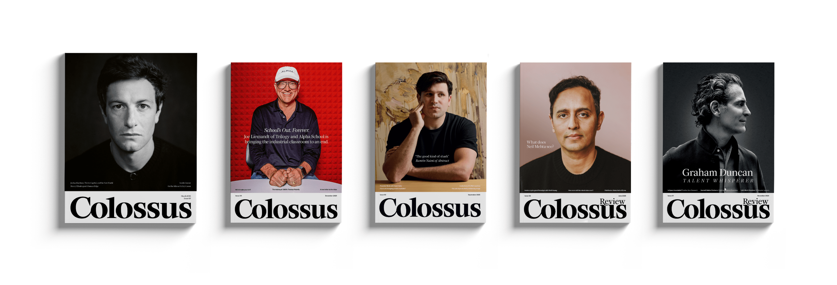
Cover Design
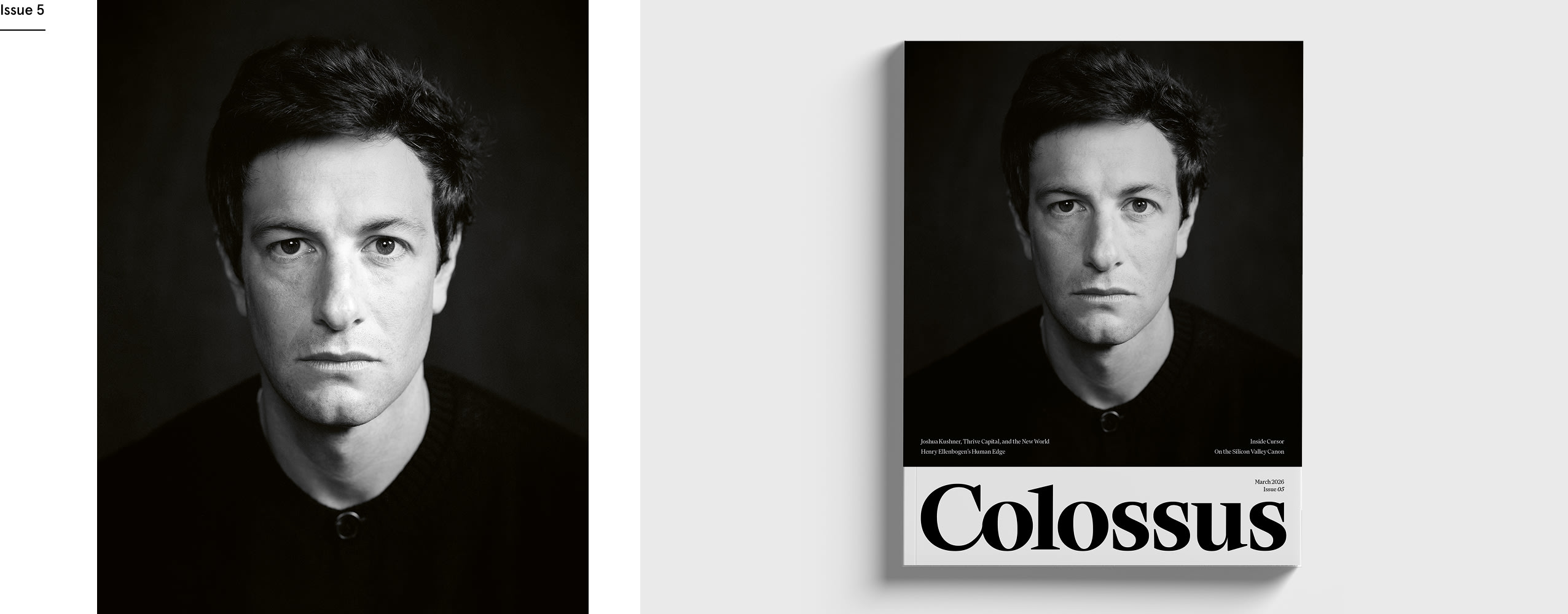
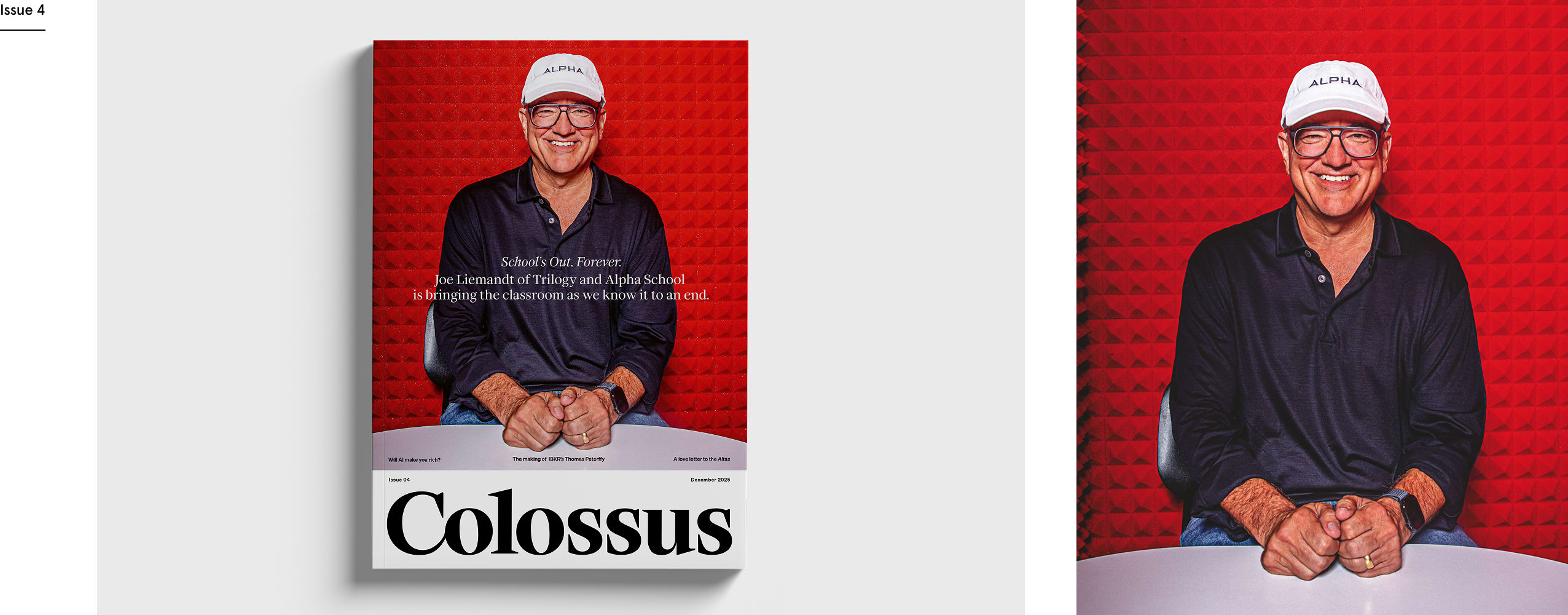
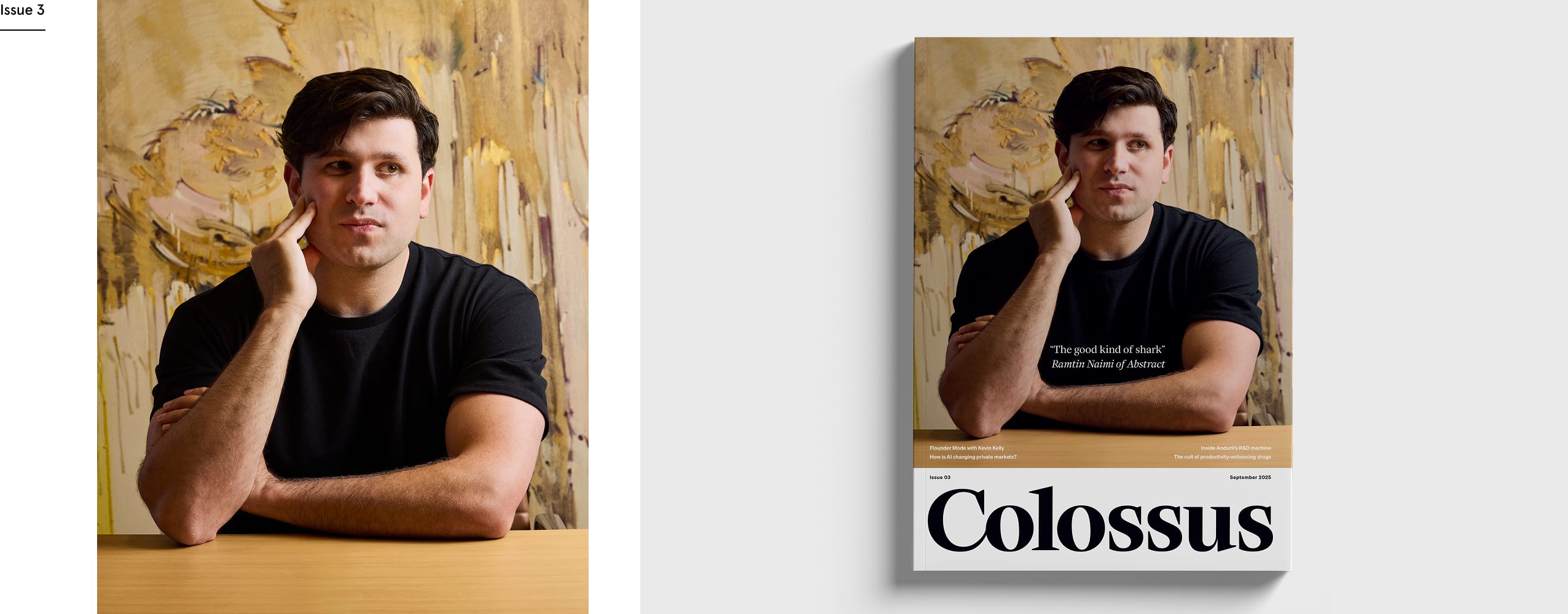
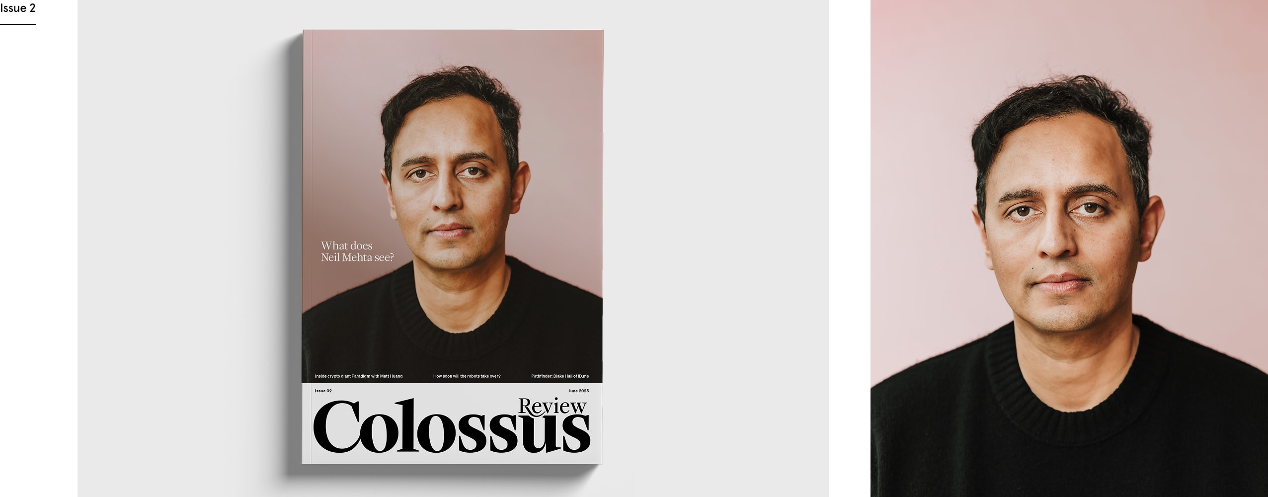
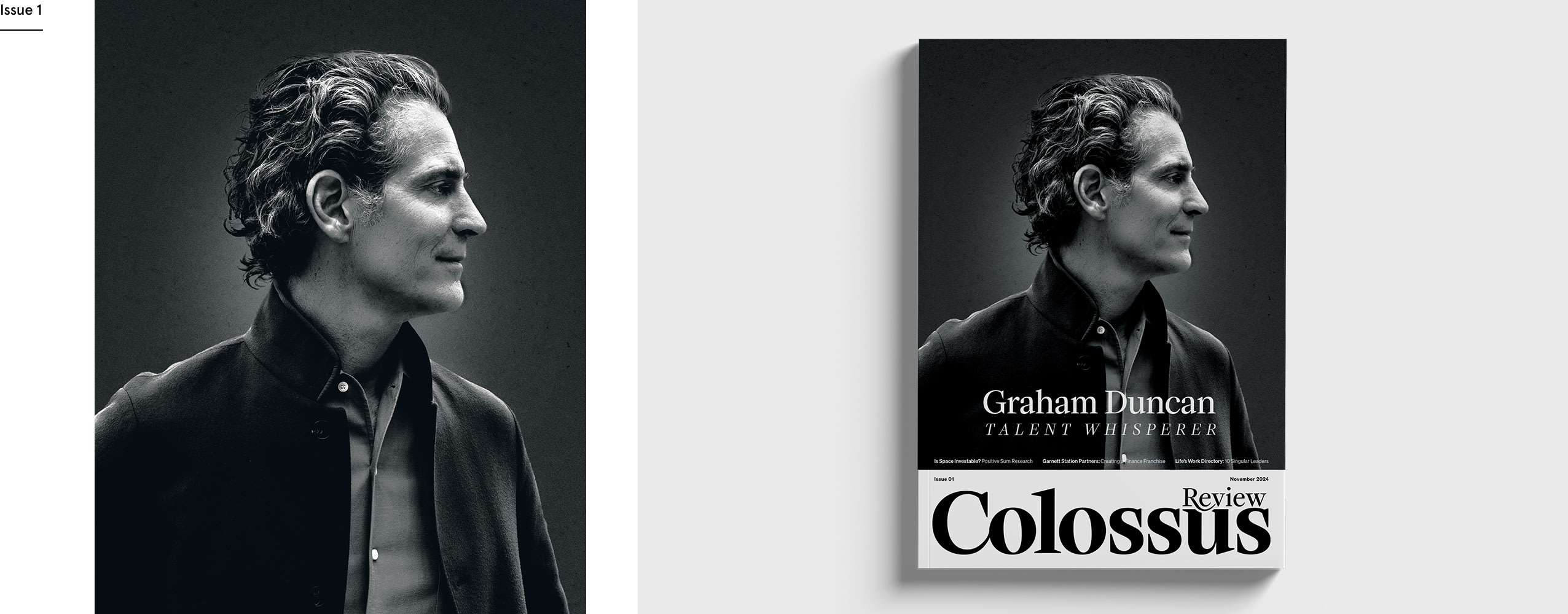
The covers gather some of the sharpest minds in business and investing, Graham Duncan among the first, Joshua Kushner among the most recent.
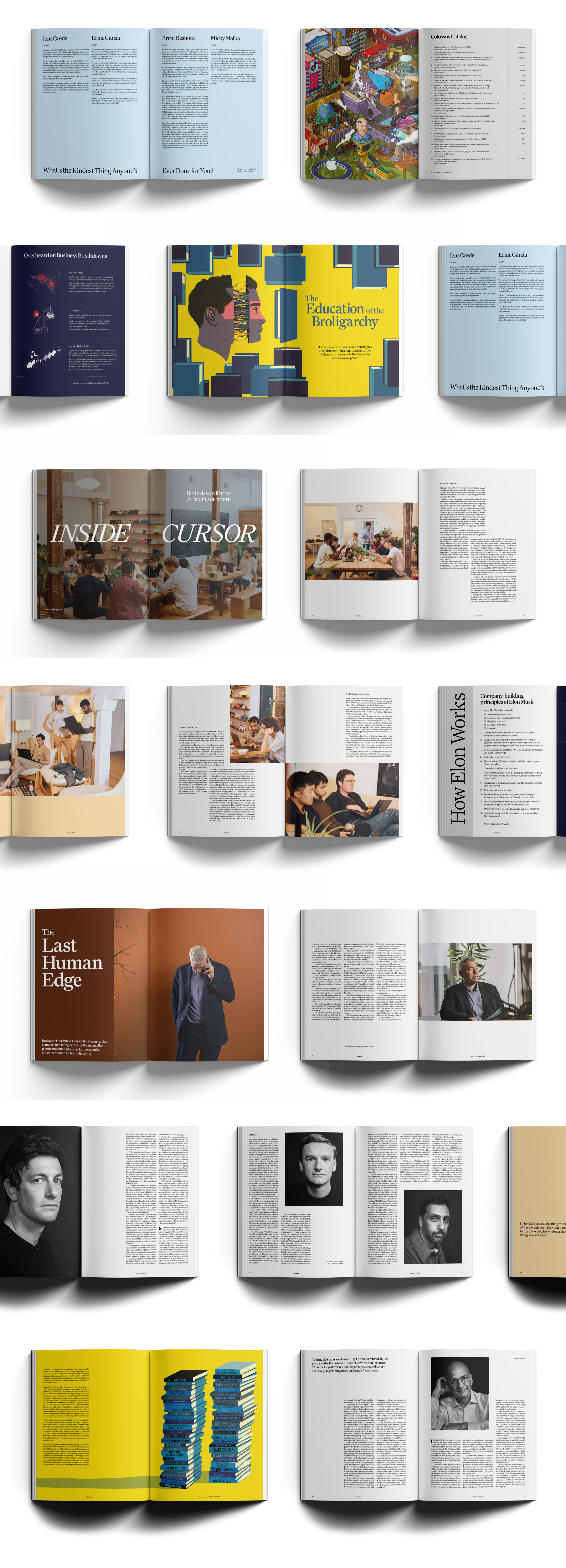
Inside the Magazine
The layouts show the magazine at work. Long features are given room to run; full-bleed photography and the odd commissioned illustration set the pace, while the typography keeps its head down and lets the writing lead. From a reported piece inside Cursor to a portrait-led study like "The Last Human Edge", each spread is built around the story rather than the other way round.