A
A
A
n
n
n
d
d
d
N
N
N
o
o
o
w
w
w

Federation of American Scientists

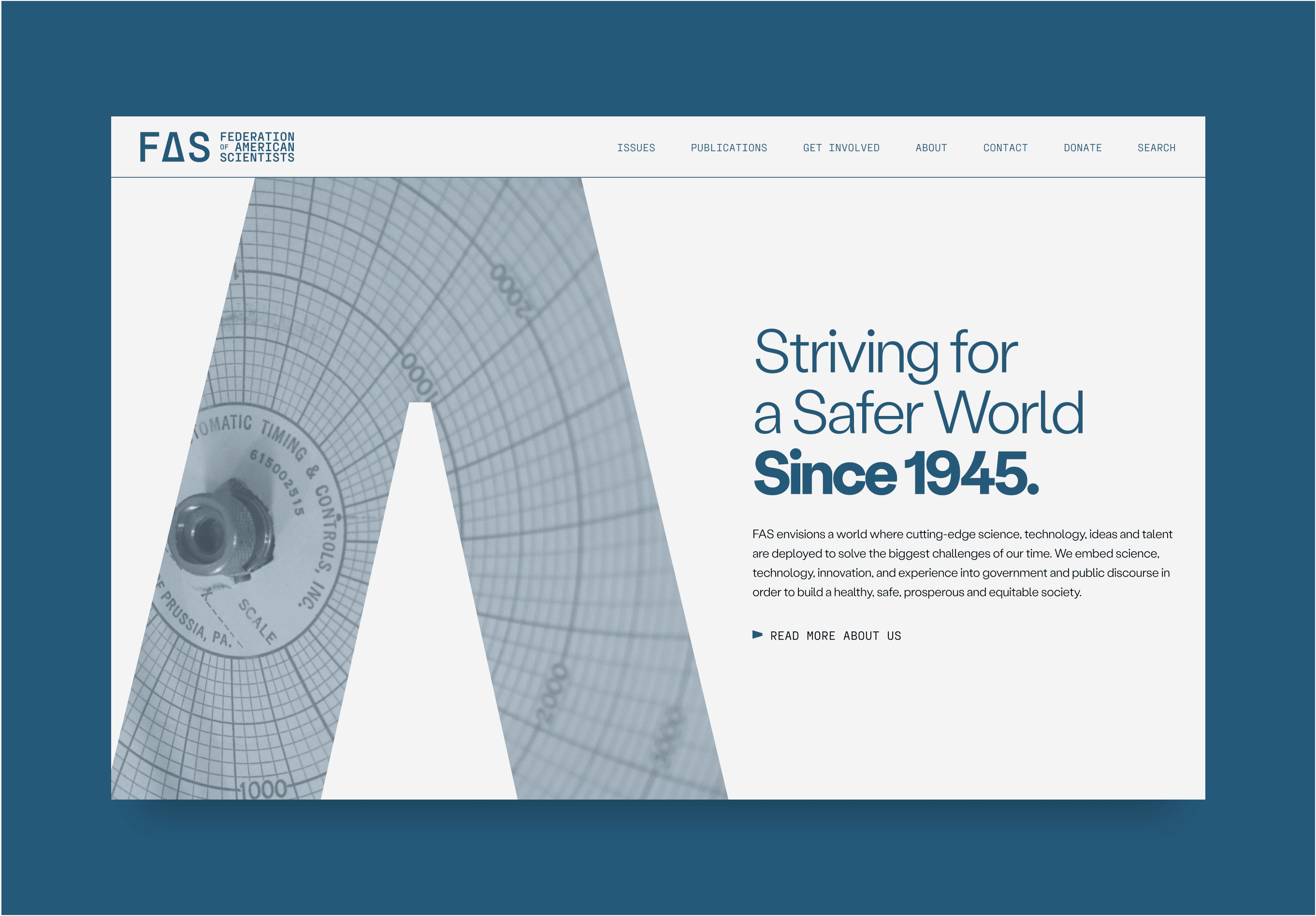
FAS envisions a world where cutting-edge science, technology, ideas and talent are deployed to solve the biggest challenges of our time.

The Federation of American Scientists works to address global risks, advance science-based policies, and tackle contemporary issues like climate change, emerging technologies, and government capacity, ensuring scientific expertise shapes policymaking for a safer, more equitable future.


The Brief

Our brief focused on refreshing FAS's visual identity to reflect its evolved approach to research and policymaking, which now emphasises timely, actionable, and ambitious Science & Technology ideas. With a shift towards action-oriented work and a commitment to shaping policy and driving societal change, the rebrand aims to align FAS’s visual presence with its dynamic growth and future aspirations.

The Solution

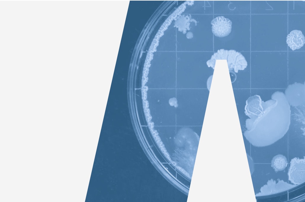
This project centres around the universally recognisable delta symbol (Δ), which has long been associated with change, transformation, and progress. By incorporating this symbol into the rebrand, we aim to visually communicate FAS' commitment to driving meaningful change within the academic policy-making sector. 

The solution is a brand that strikes a balance between modernity and legacy, presenting FAS as a forward-thinking organisation that appeals to a new generation of policy-makers, while maintaining the credibility and reputation it has built since its founding in 1946. This website was built in collaboration with our friends at TGHP.
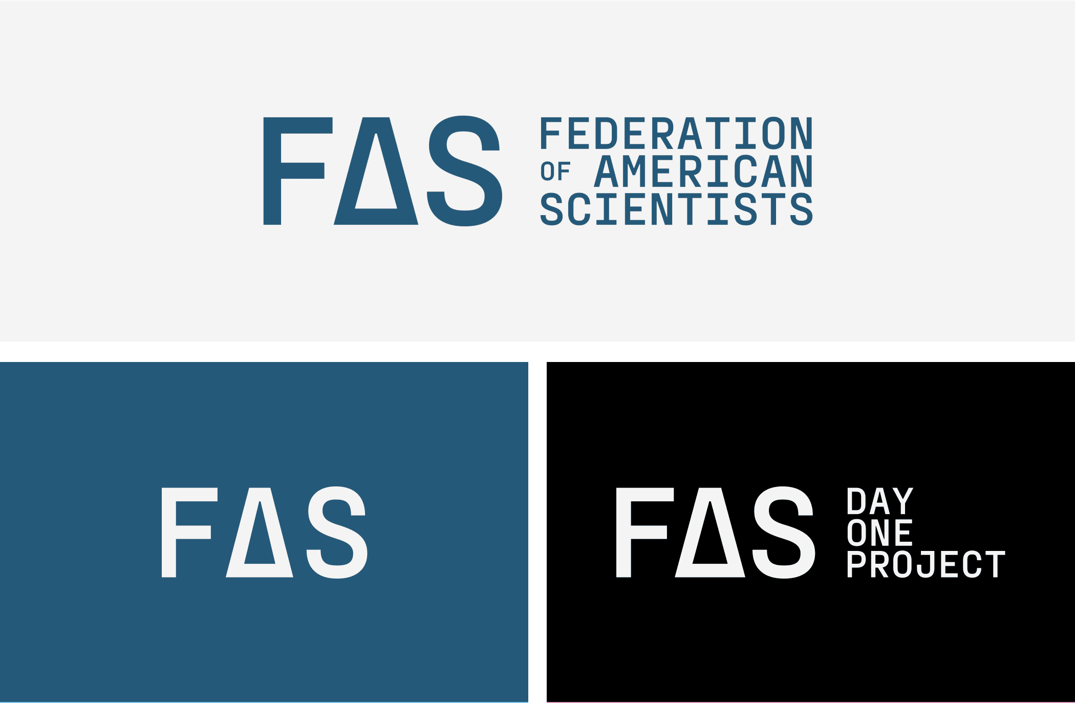
Logo
Meaningful Difference & Brand Values
Policy, research and advocacy focused on science, technology and innovation.
  • Future focused
  • Considerate
  • Relevant
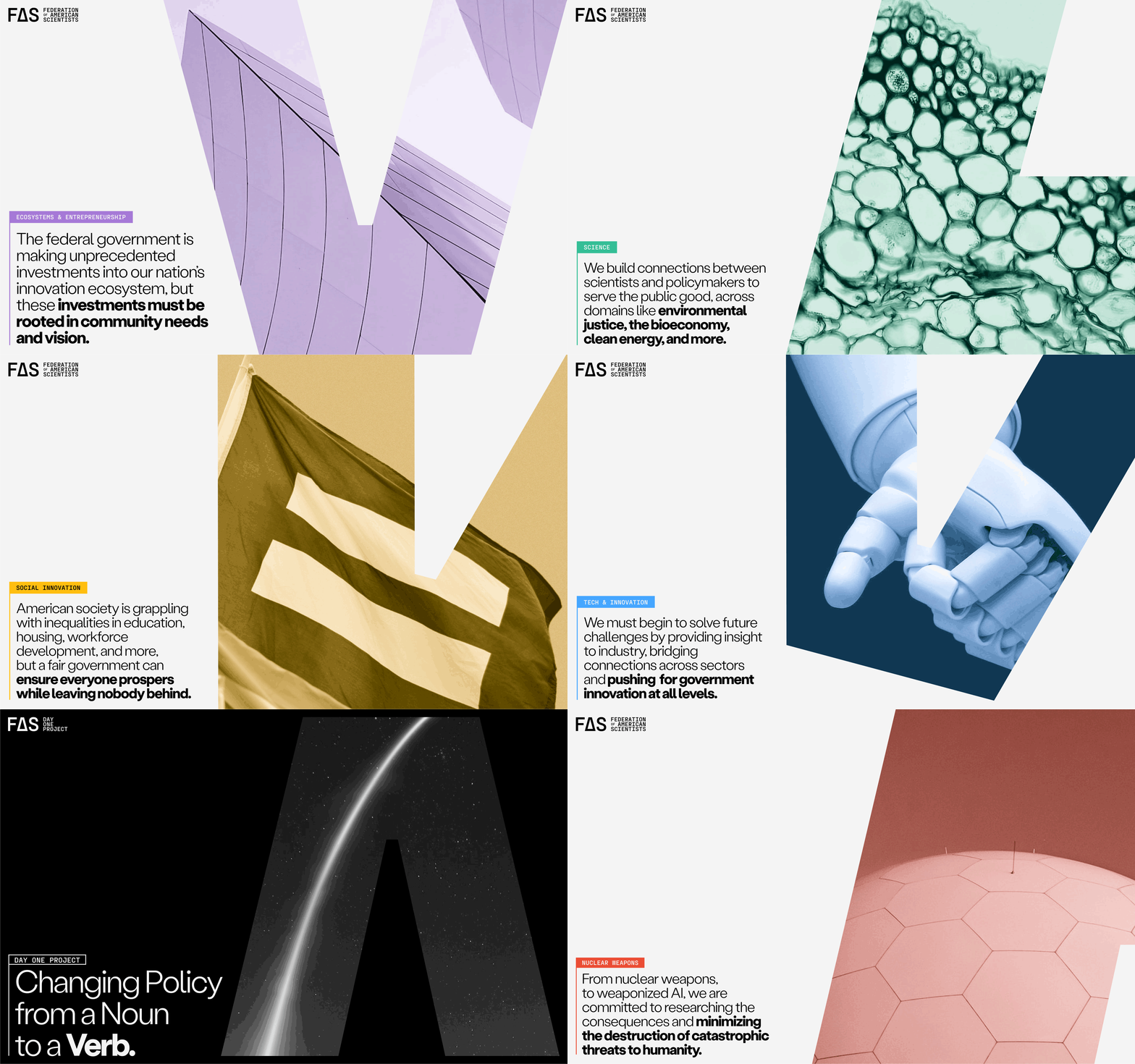
Colour Palette & Visual Messaging

The Delta Symbol

The delta serves as a powerful and easily identifiable marker of progress, resonating with both established thought leaders and a new generation of change-makers. Its inclusion reinforces the organisation’s mission to advocate for thoughtful, impactful change, while also signalling a forward-thinking, dynamic approach to shaping the future of academic policy.

Typography

The chosen typefaces, Stabil Grotesk and PP Fraktion Mono, reflect the organisation's blend of contemporary approach and established legacy. Stabil Grotesk conveys clarity, professionalism, and forward momentum, while PP Fraktion Mono adds precision and structure, highlighting the technical, research-driven nature of the work.

In Application

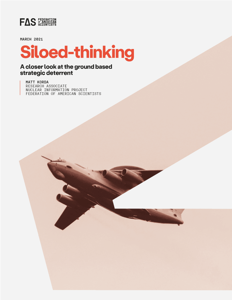
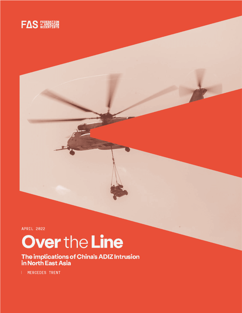
The rebrand adopts a bold, clear layout with strong lines and a minimalist design, ensuring cohesive visual identity across all touchpoints. This approach enhances readability, reinforces FAS’s professionalism, and positions the organisation as a forward-thinking leader in academic policy-making.

The FAS Website

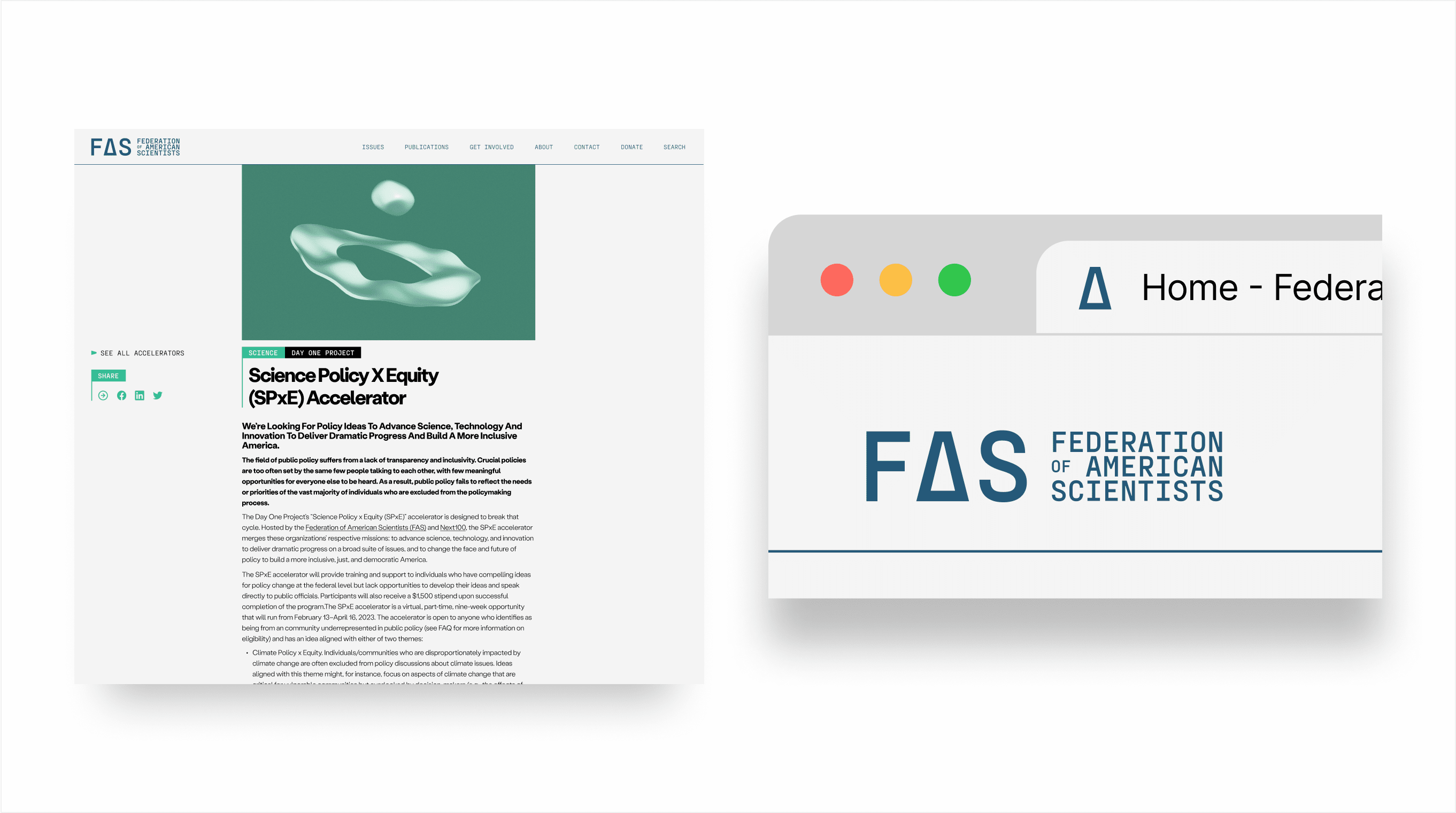
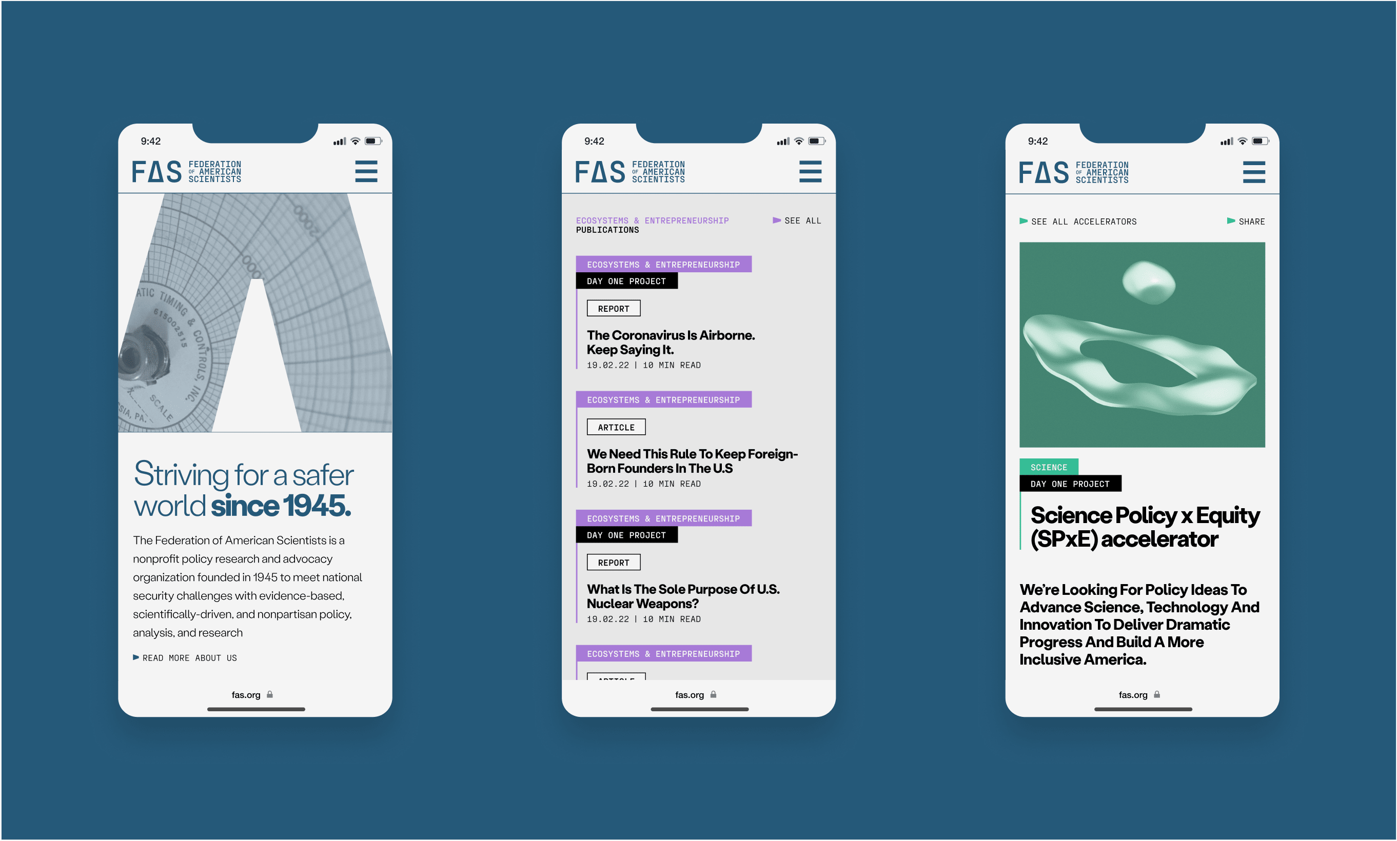
The website follows the same bold, clear, and recognisable design principles, offering a streamlined, user-friendly experience that reflects FAS's modern, action-driven ethos while maintaining a professional and authoritative presence.

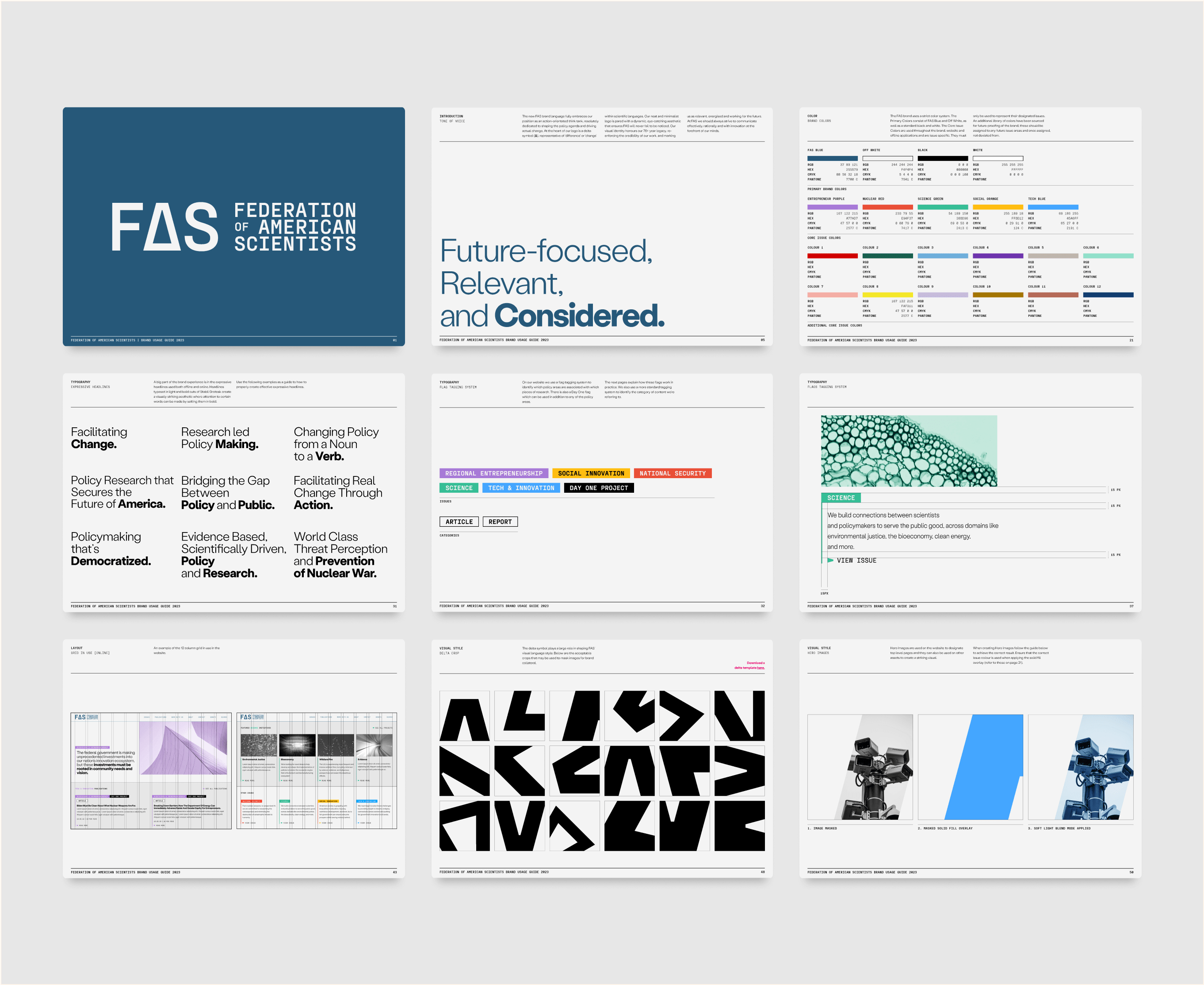
Brand Guidelines

A comprehensive set of guidelines were produced to ensure the FAS brand could be applied correctly in house.