Forethought
Combining academic rigour with a willingness to explore the unconventional, their aim is to clarify what is at stake as technology accelerates. With a focus on clarity, openness, and intellectual humility, Forethought’s body of research is meant to inform better decisions about a transition that will reshape human society. The site: forethought.org.
To create a brand identity and website that reflected Forethought’s credibility and rigour as well as their intellectual adventurousness and proudly “nerdy outlook.” Avoiding the tropes of tech branding or overstyled futurism, it needed to feel understated, thoughtful, and timeless. In short: a brand identity that would let their ideas speak first.
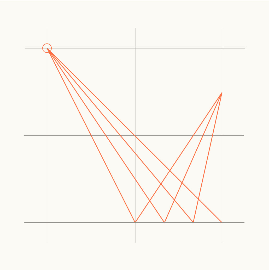
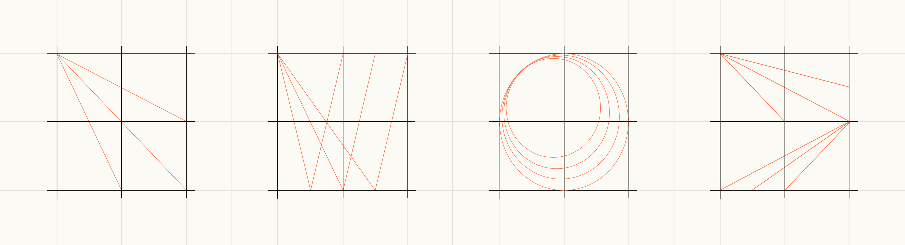
We developed a visual language rooted in the traditions of research: perspective drawings, marginal notes, clean typography, and pared-back layouts. The result is a brand and website that steps back, keeping focus on what matters.
- Clarity over noise
- Focus on what matters
- Serious but simple

Typography
Graphic System
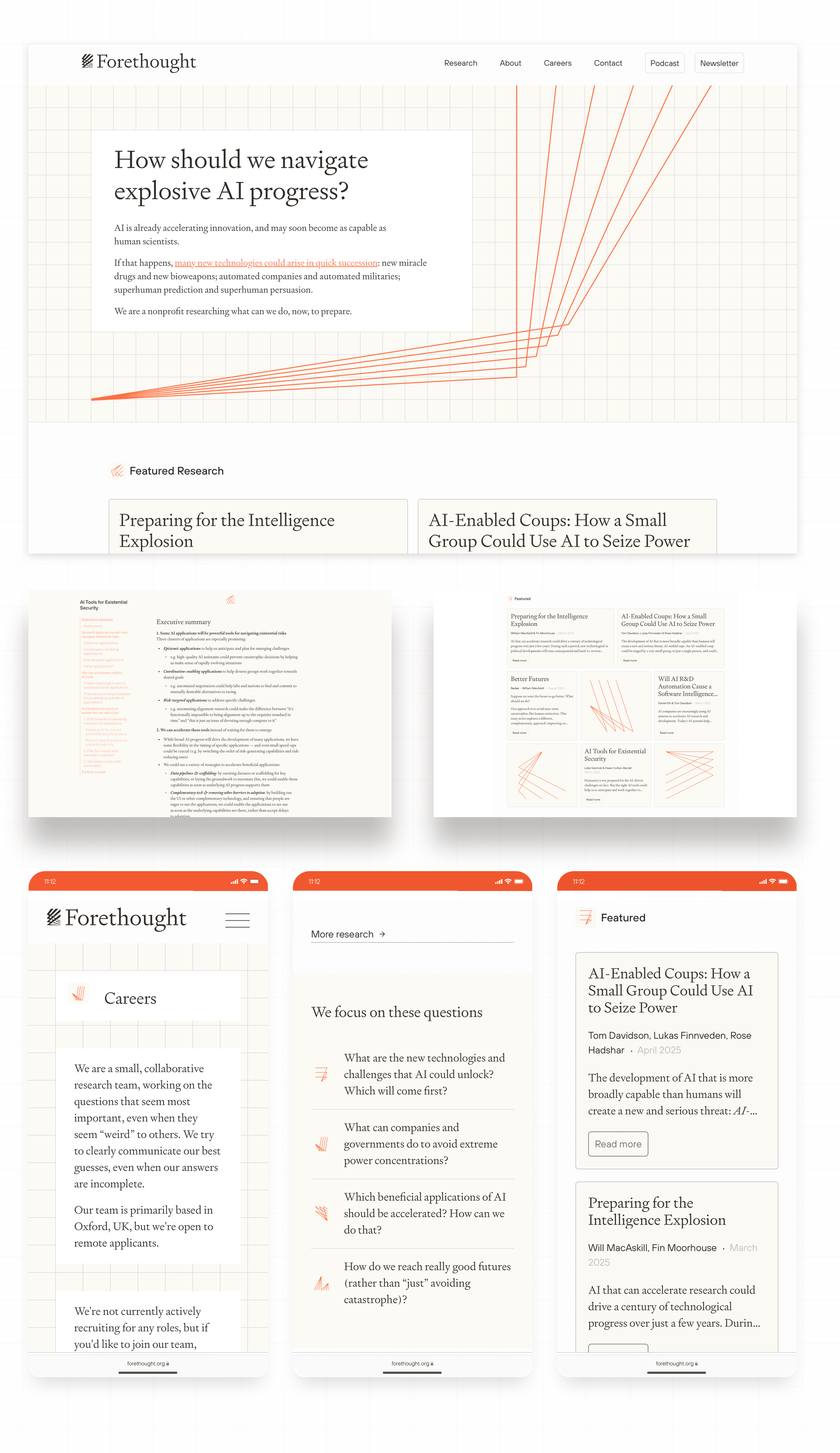
Website
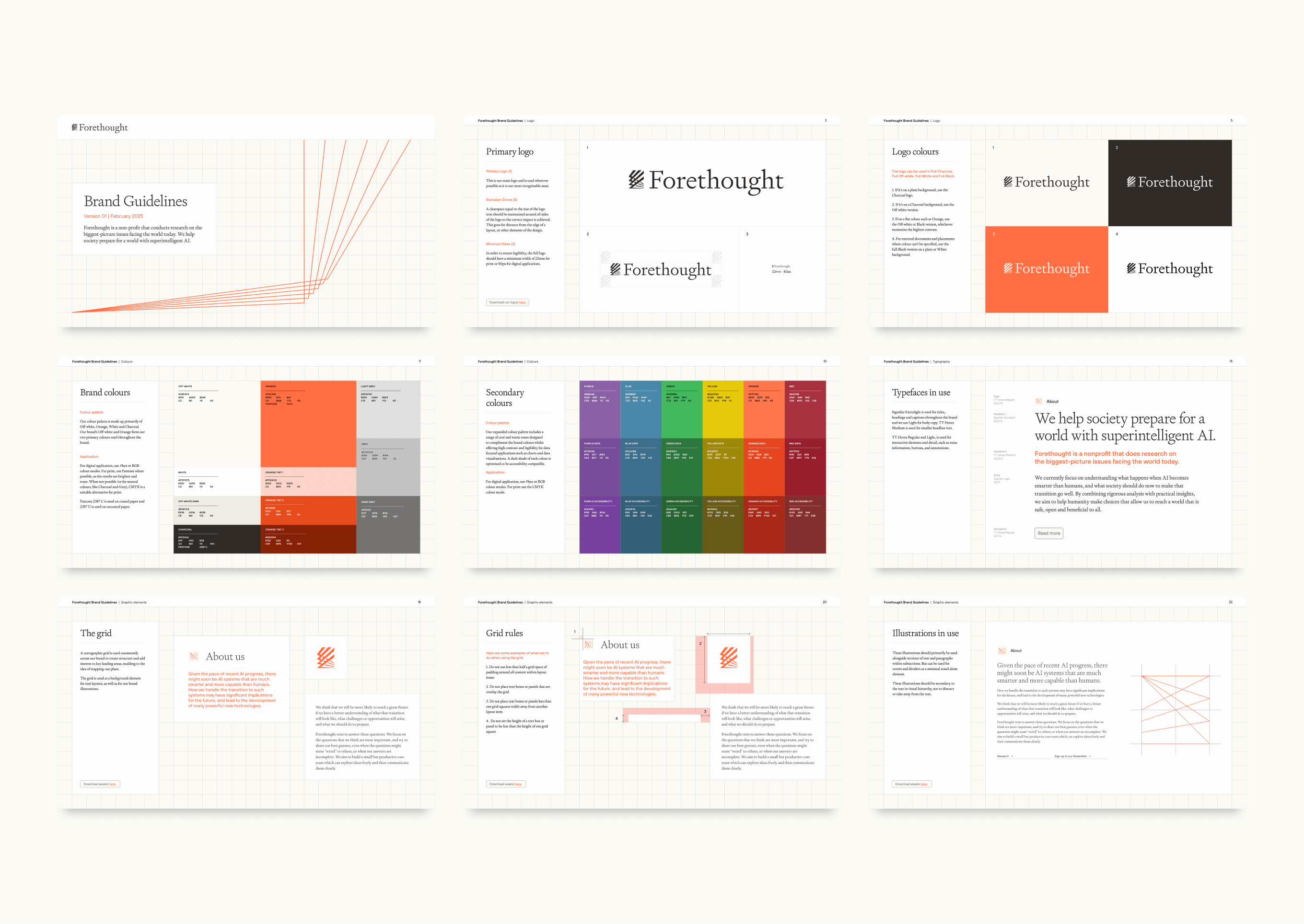
Brand Guidelines