A
A
A
n
n
n
d
d
d
N
N
N
o
o
o
w
w
w

Metropolitan Abundance Project

Dedicated to making California an affordable and equitable place to live and work.

The Metropolitan Abundance Project (MAP) is a bold new initiative from California YIMBY, designed to inspire the future of urban living and revitalise American cities. Serving as a central hub for innovative ideas and actionable strategies, MAP empowers policymakers, urban planners, and advocates to create thriving, equitable, and sustainable metropolises.


The Brief

The design brief called for a visually distinct brand identity that exuded sophistication and a sense of abundance, drawing from mid-century modernism and subtle ties to California YIMBY, while maintaining a forward-thinking, academic look that aligned with MAP’s intellectual mission.

The Solution

The identity blends optimism and possibility, drawing inspiration from mid-century design to create a sense of "looking to the past to shape the future." It remains visually distinct yet complementary to the existing California YIMBY aesthetic, maintaining a cohesive and harmonious feel.
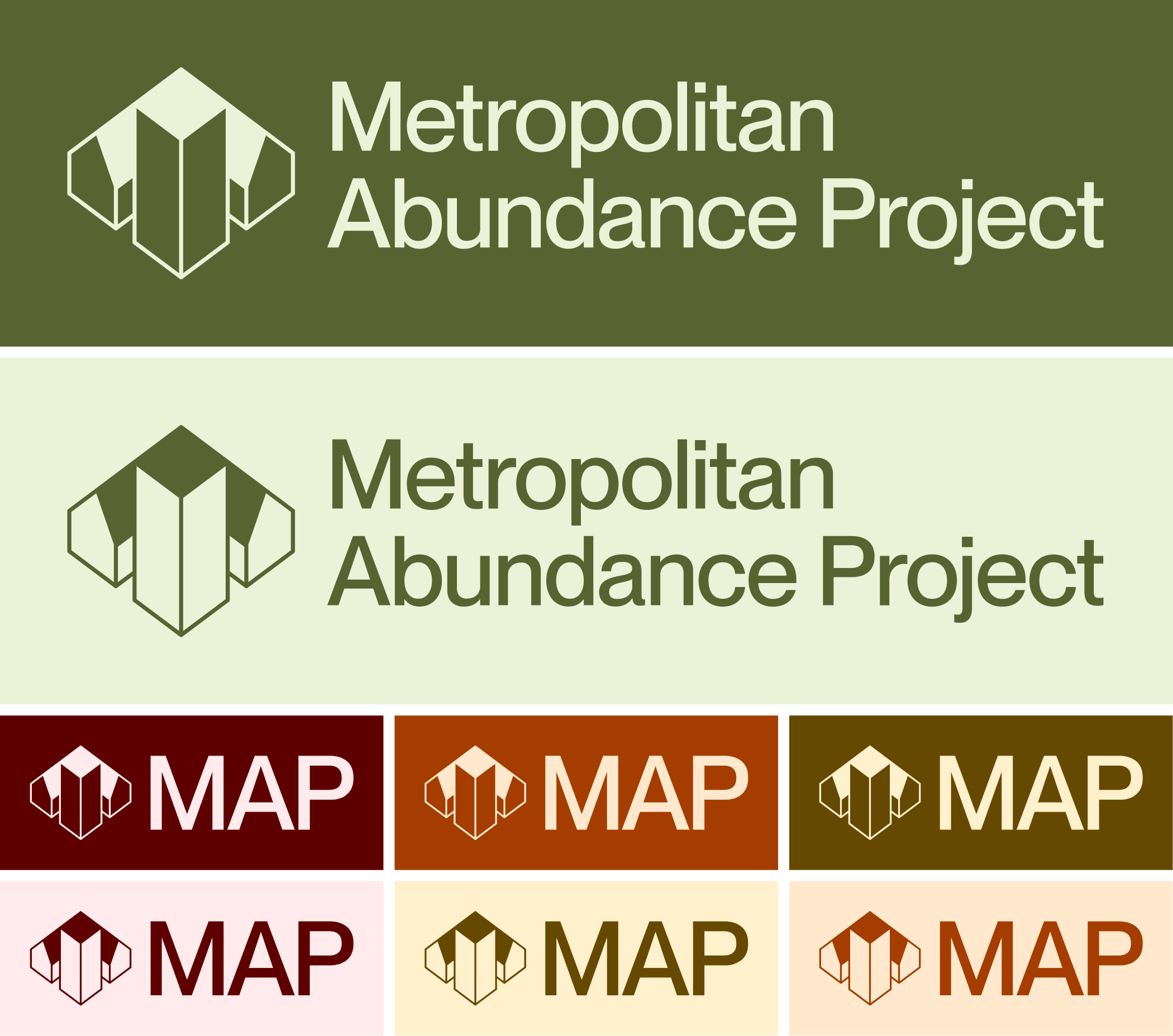
Logo
Meaningful difference & Brand Values
Conveying the energy and possibility of the abundant cities vision.
  • Warm
  • Confident
  • Academically Rigorous
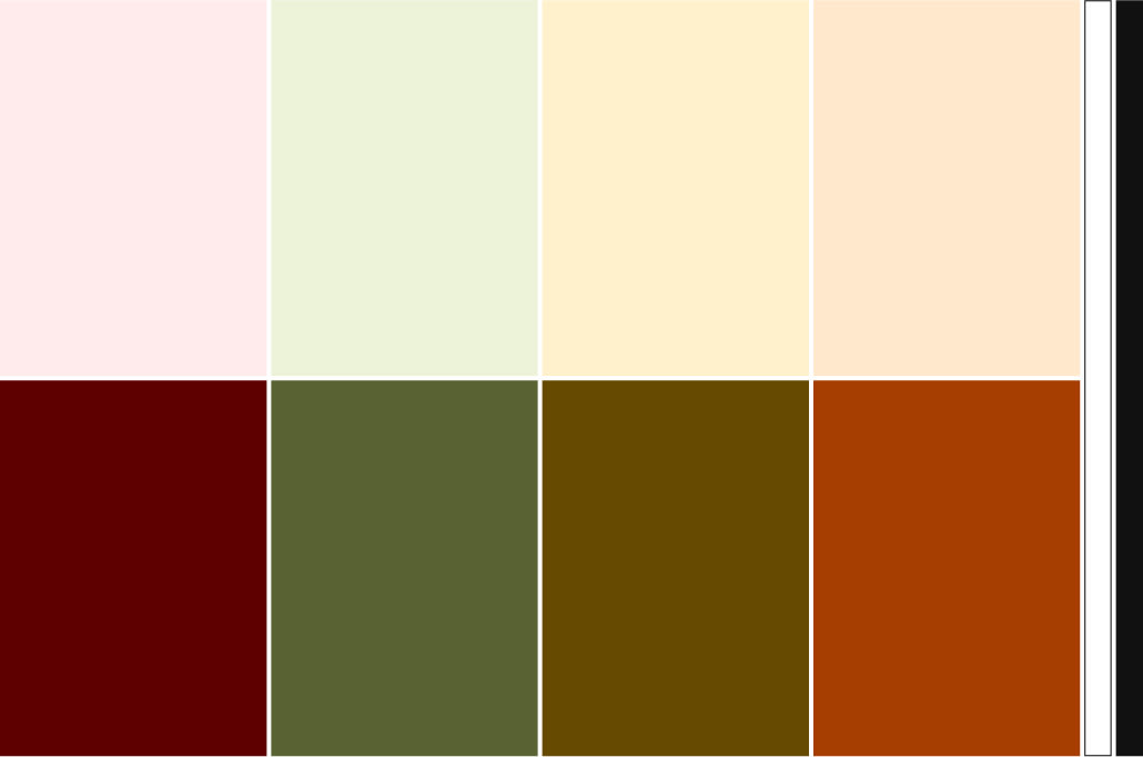
Colour Palette & Visual Messaging

Typography

Typography is a key element of this brand, with the choice of PP Neue Montreal as the primary sans-serif typeface. This typeface was selected for its clarity, legibility, and modern yet timeless feel, embodying the principles of midcentury modern design. Its clean, confident lines complement the overall aesthetic, reinforcing MAP's role as a forward-thinking leader in the policy space. Paired with the visual identity, the typography helps position MAP as a credible and sophisticated voice in the urban abundance movement.

Illustration

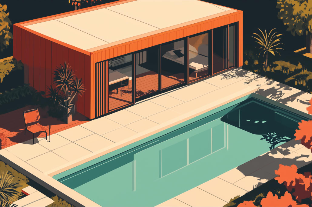
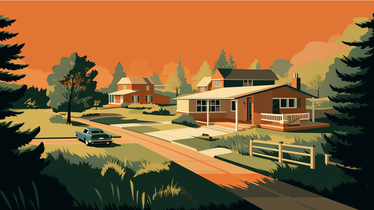
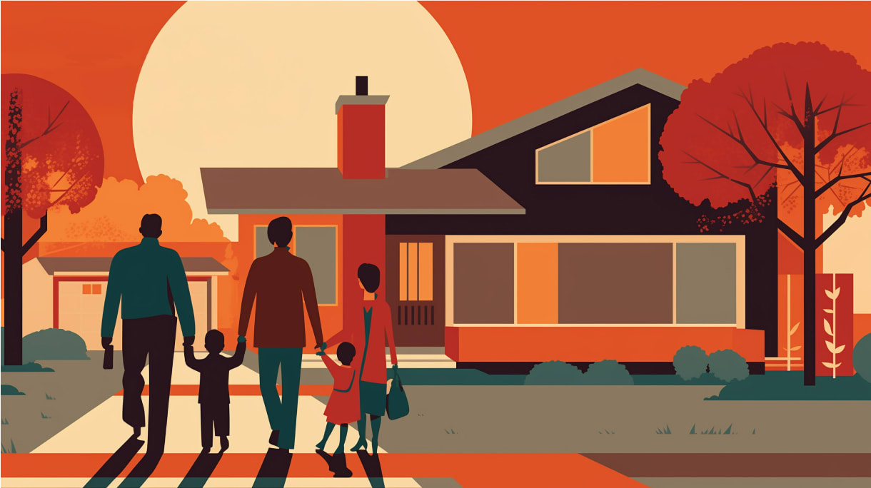
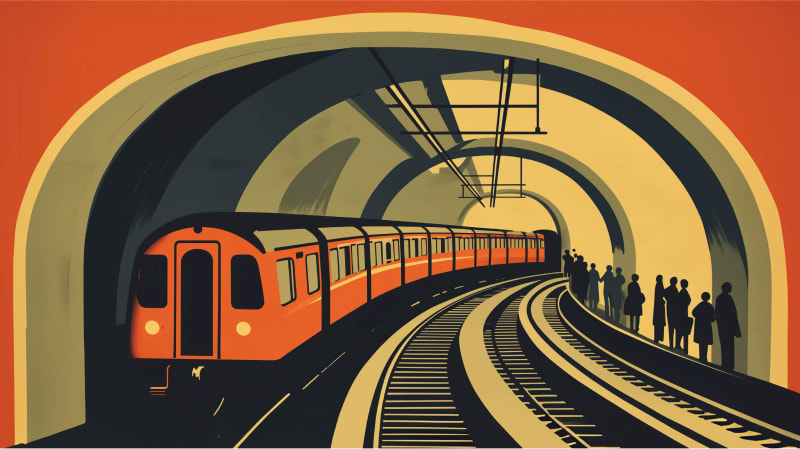
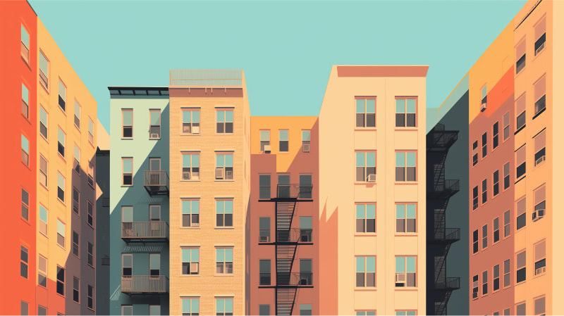
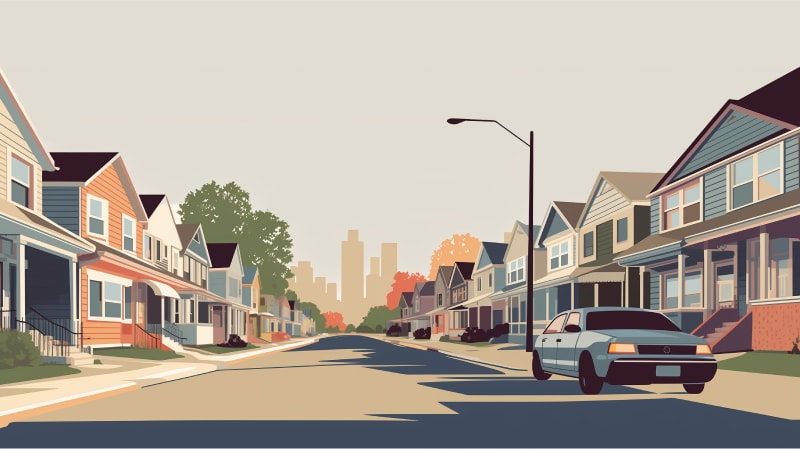
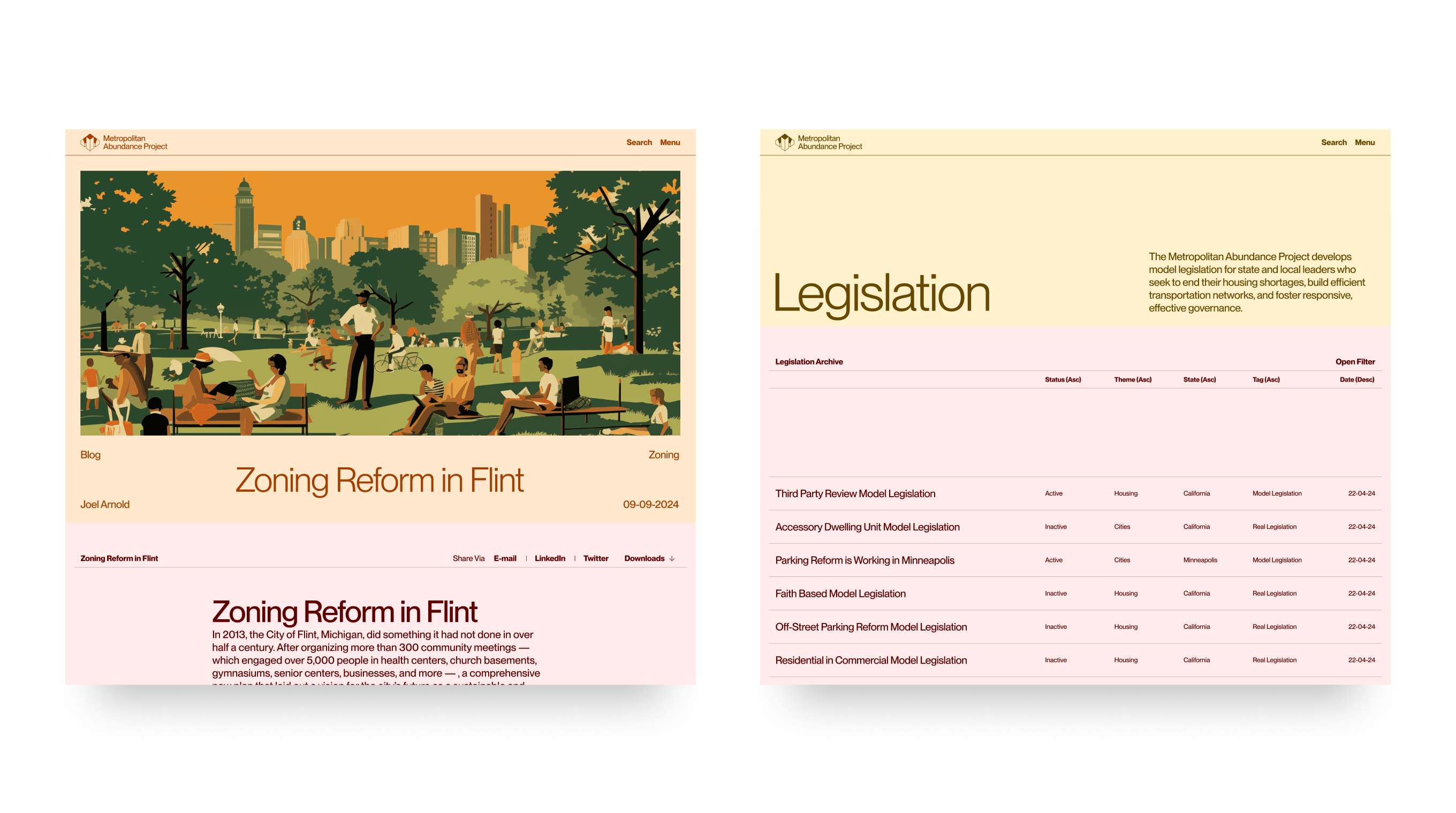
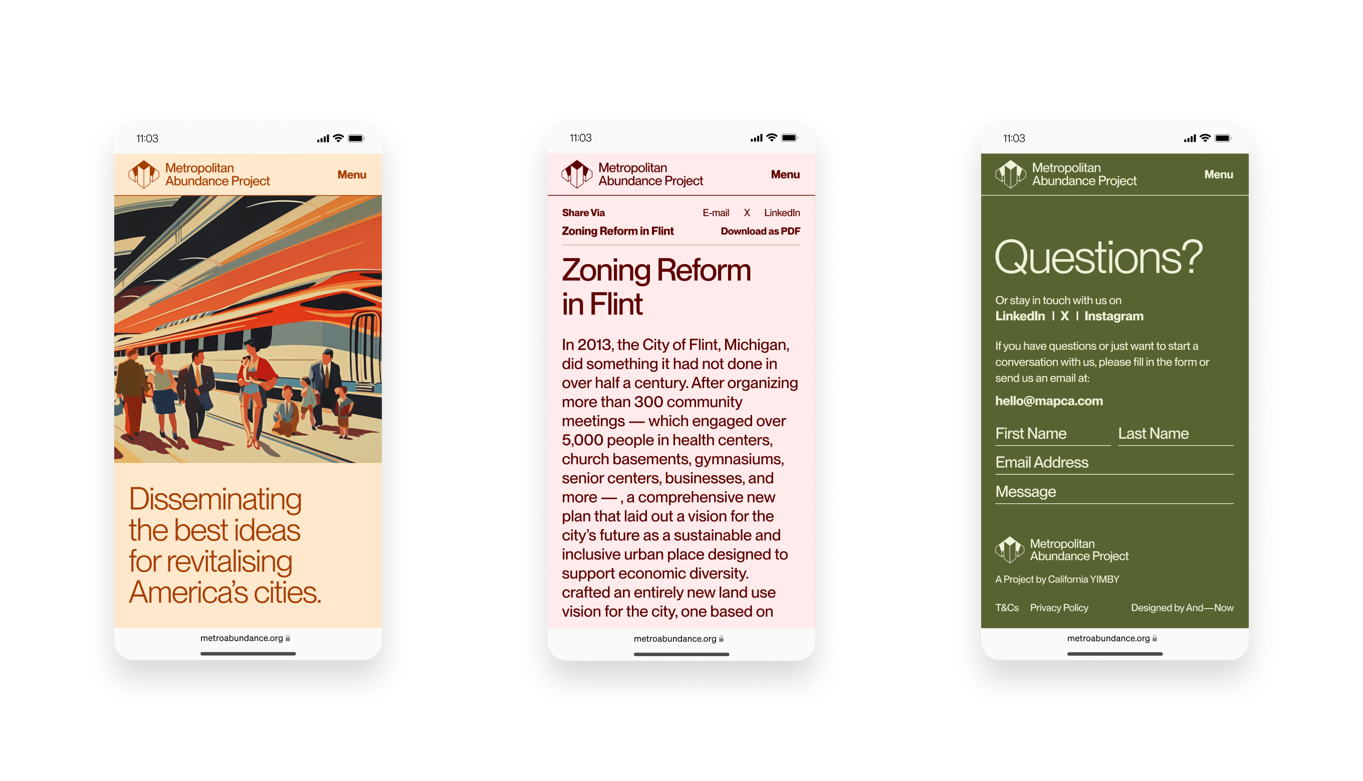
To answer the brief, we curated a selection of illustrations generated through Midjourney, strategically integrated across the website to complement articles and blogs. Drawing inspiration from mid-century modern art, these visuals evoke a warm, optimistic atmosphere, aligning with MAP’s vision of a vibrant and hopeful future for cities. The illustrations enhance the content, visually reinforcing the brand's focus on progress and abundance.

The MAP Website

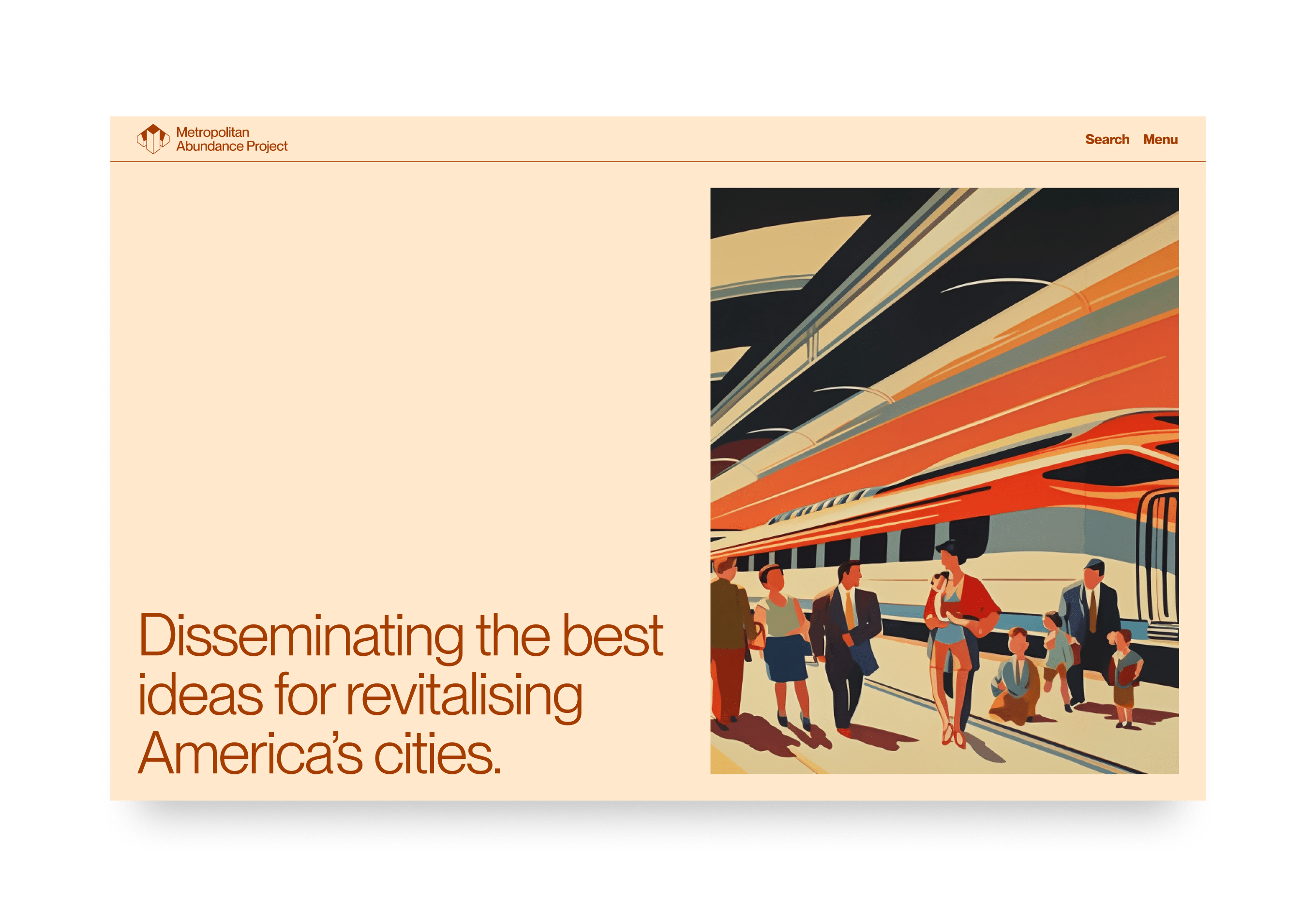
On the website, we implemented a precise, gridded layout for the content, ensuring a structured and spacious design that accommodates long-form writing while maintaining readability and visual clarity across digital screens.