Niskanen Center
The Niskanen Center is a nonpartisan public policy think tank based in Washington, D.C. which produces forward-thinking and creative policies that transcend ideological lines.
Niskanen’s work bridges the gap between high-level theory, practical policy, and real-world advocacy— a unique three-pronged approach intended to lay the foundations for a new vision of American governance. One of its greatest strengths is that the organisation is not tied to any political faction. This allows the team to draw ideas from across the ideological spectrum, and to persuade, rather than preach to a base–enabling both creative thinking and political effectiveness.
Brief
The Niskanen Center undertook a brand refresh and website redesign to present itself as a mature, forward-thinking, and authoritative institution. The evolved brand reflects the Center’s professional growth, showcases its policy impact, and aligns with the organisation’s ambitions for the next decade.
Solution
Visualised as an isometric graphic language, the concept communicates Niskanen’s layered thinking and ideological synthesis, reinforcing the Center’s unique position at the intersection of theory and practice. Geological strata and structures formed over time inspired the refreshed brand: a visual metaphor for layers of built-upon knowledge that shift and evolve, growing ever stronger.
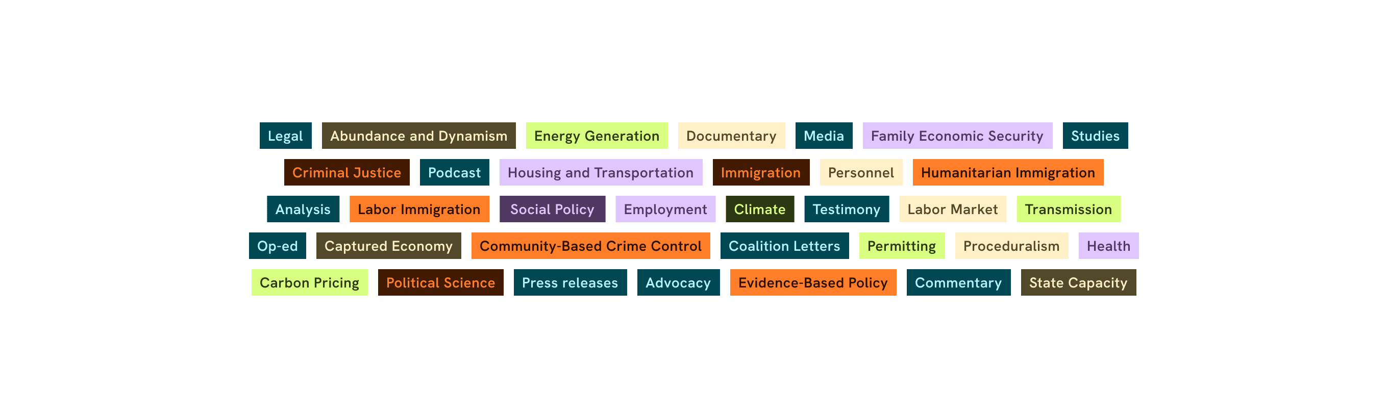
Inspired by the concept of “radical moderation”, the brand balances authority with approachability through a refined serif/sans-serif typographic combination, a modernised teal-led palette, and an editorial image treatment. The result is a confident, cohesive identity built for influence, trust, and long-term relevance.
Logo

Core Creative Concept & Brand Values
Radical moderation, made visible: layers of knowledge built up over time, each one strengthening the last.
- Non-partisan
- Forward-thinking
- Impactful
Colour Palette & Visual Messaging


Typography
A refined serif/sans-serif typographic combination balances authority with approachability.
Spectral combines academic elegance with modern readability whilst Pubic Sans provides legibility and clear hierarchy through its neutral, clean glyphs.

Imagery
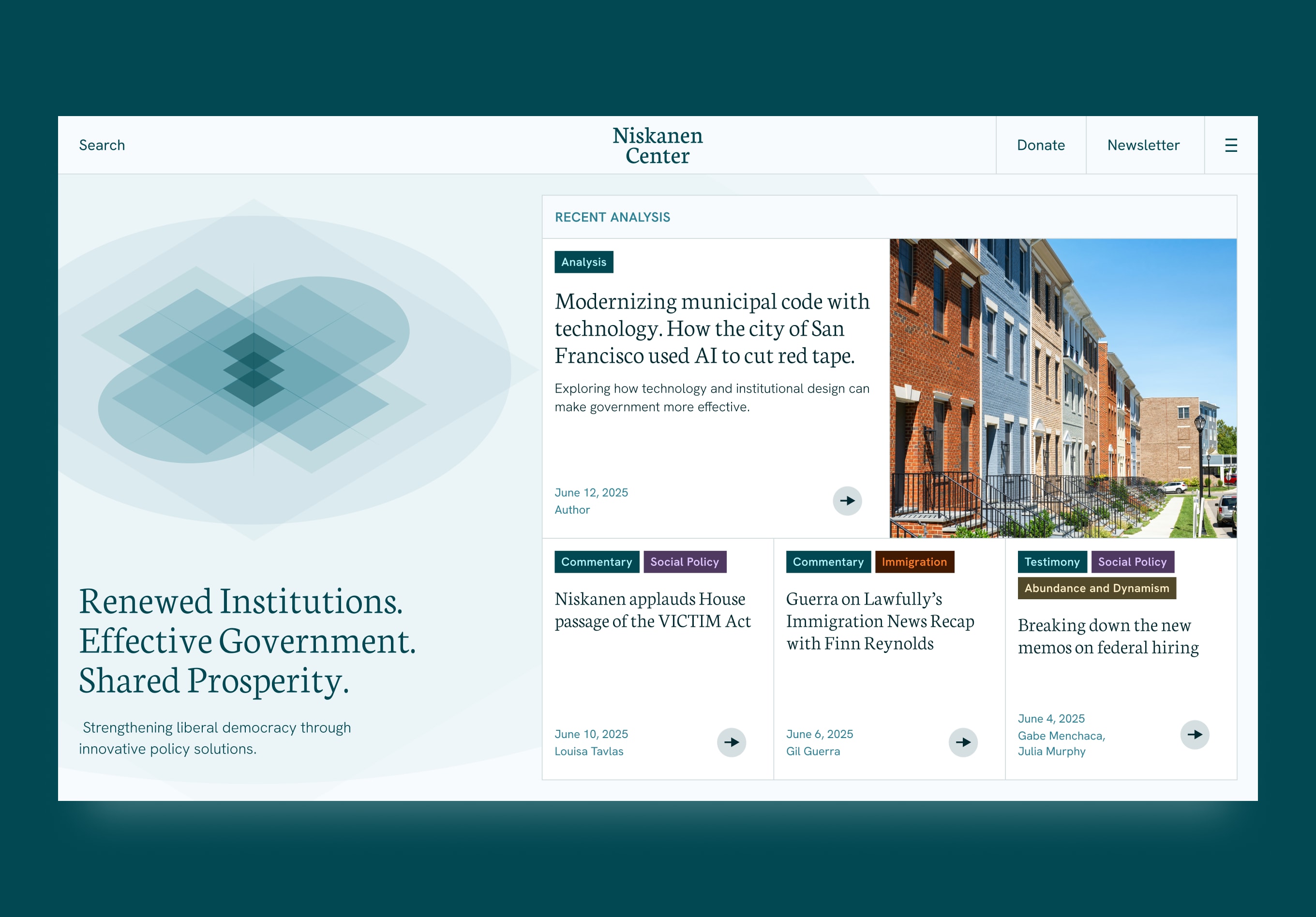
An overlapping, isometric graphic language demonstrates depth and structure through a subtle blend of opacities. The geometric overlays communicate Niskanen’s layered thinking, reinforcing the Center’s unique position at the intersection of policy, theory and advocacy.




Website
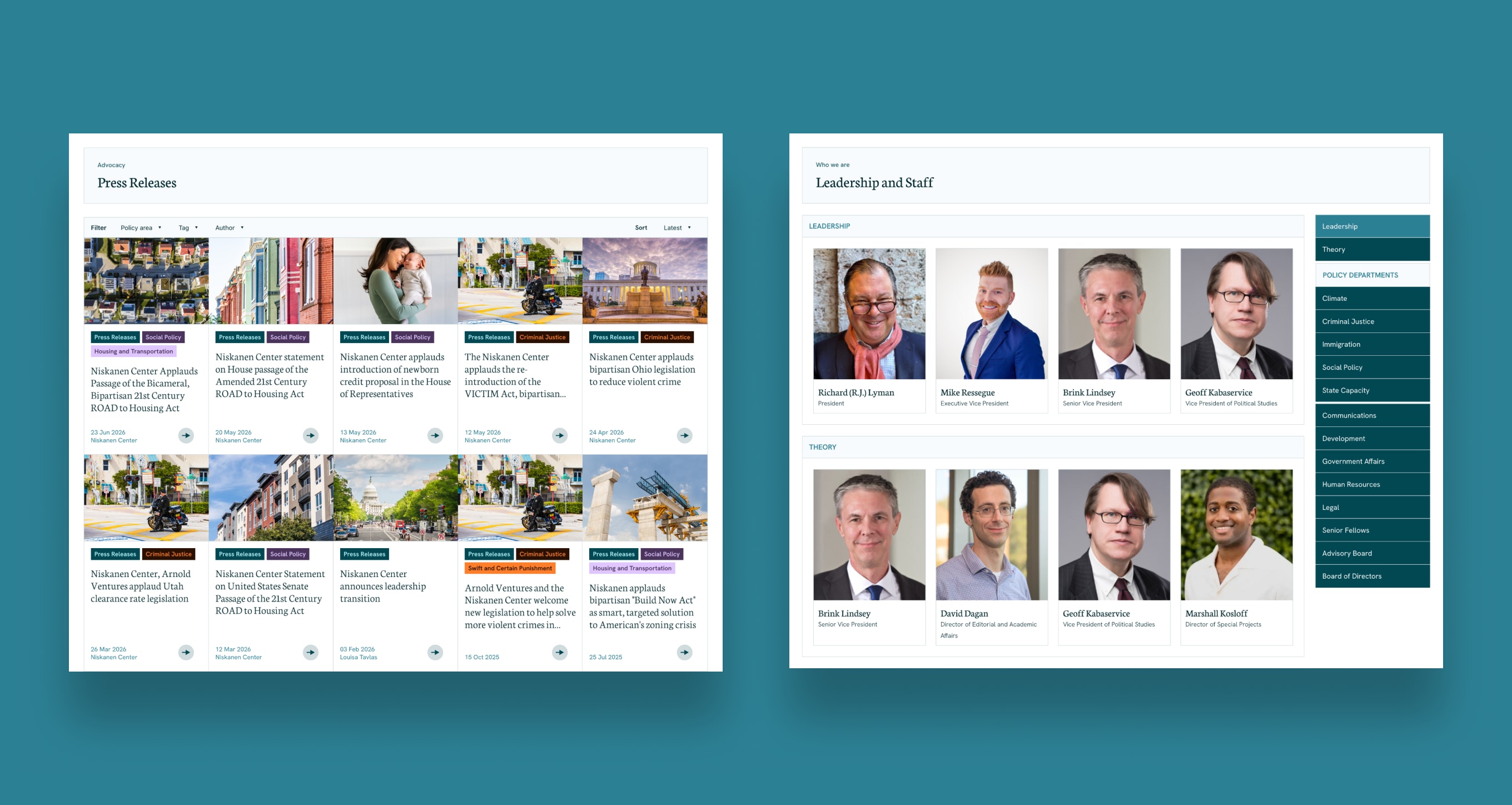
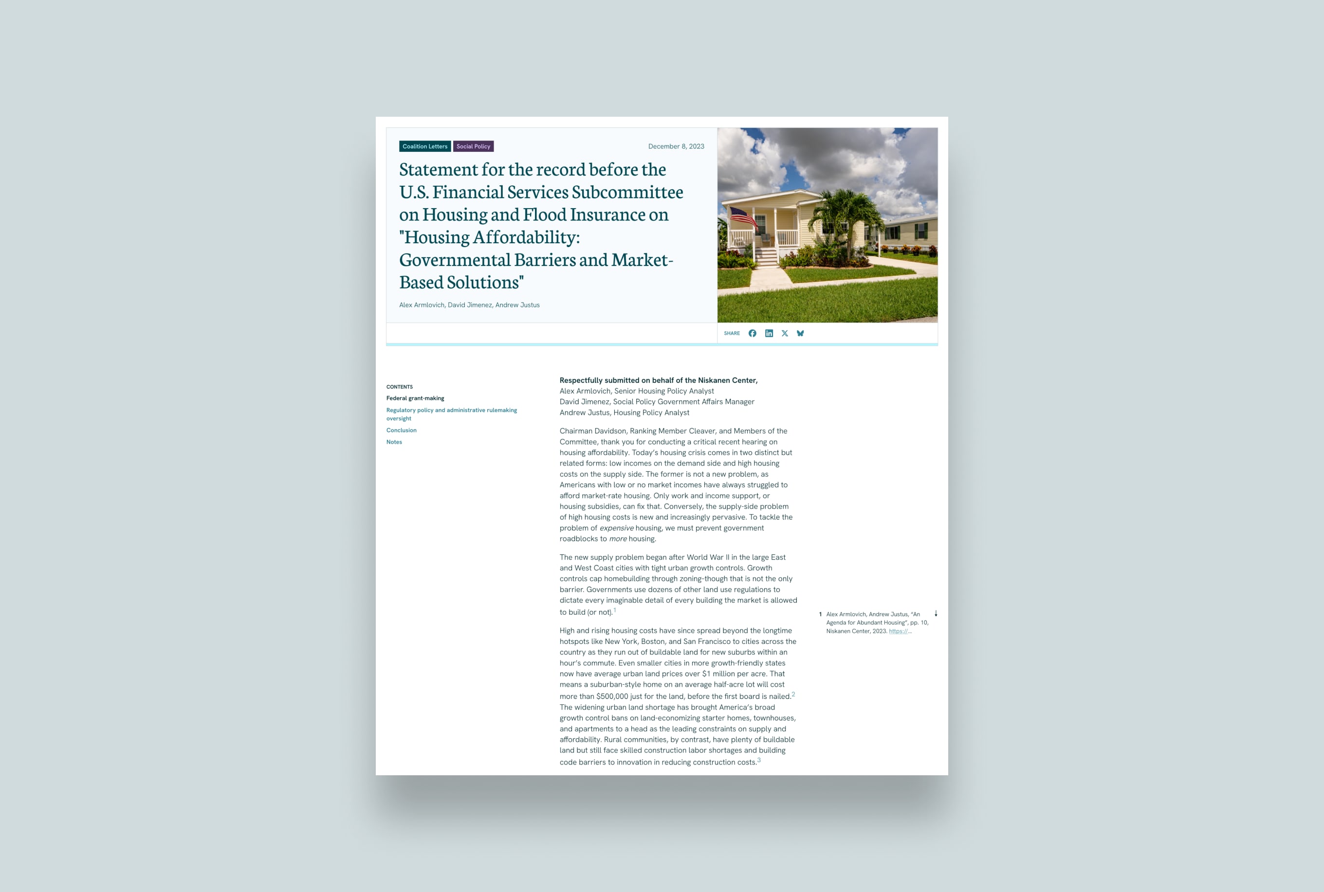
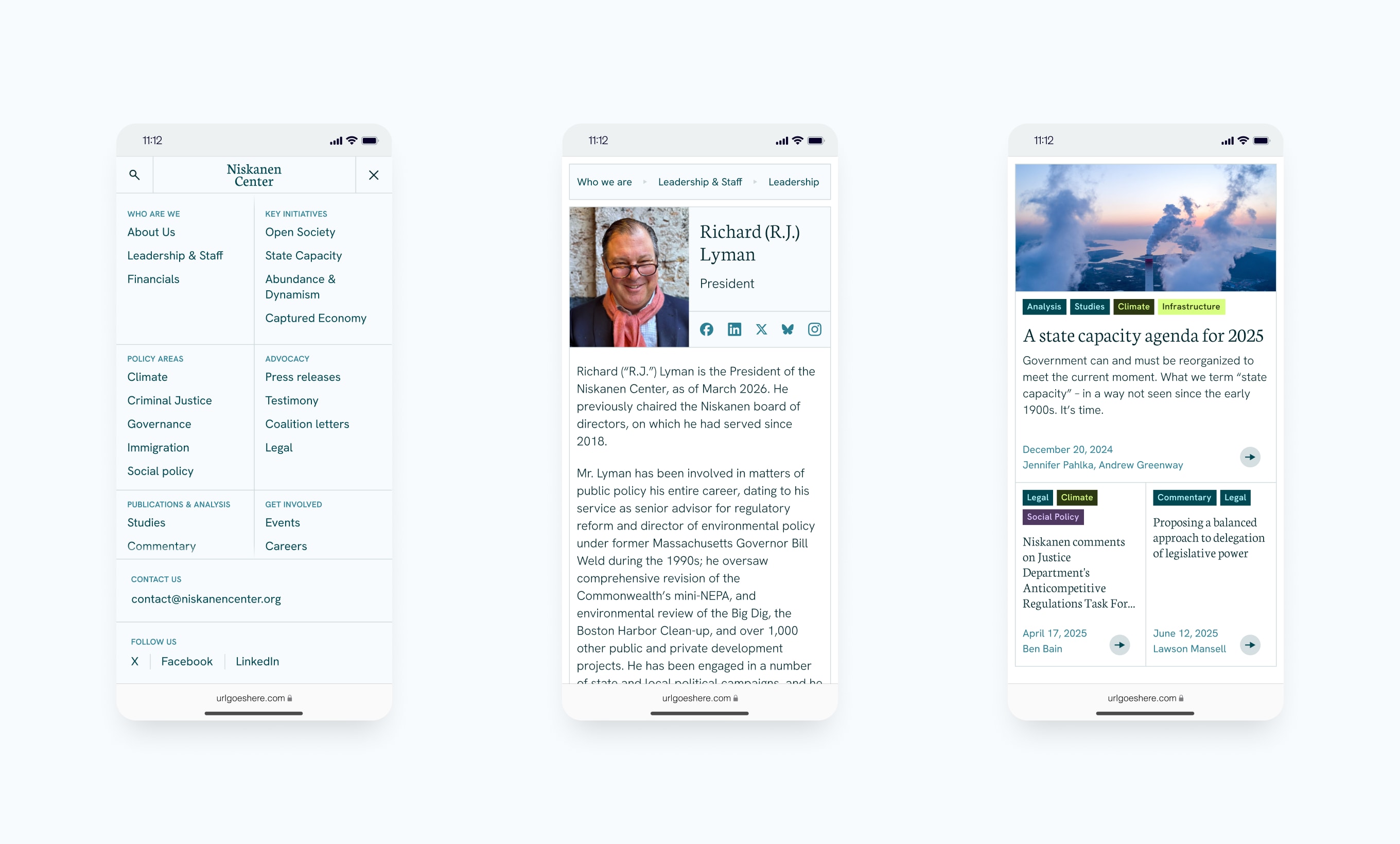
We translated the refreshed "radical moderation" brand into a live website that reads as authoritative yet approachable.