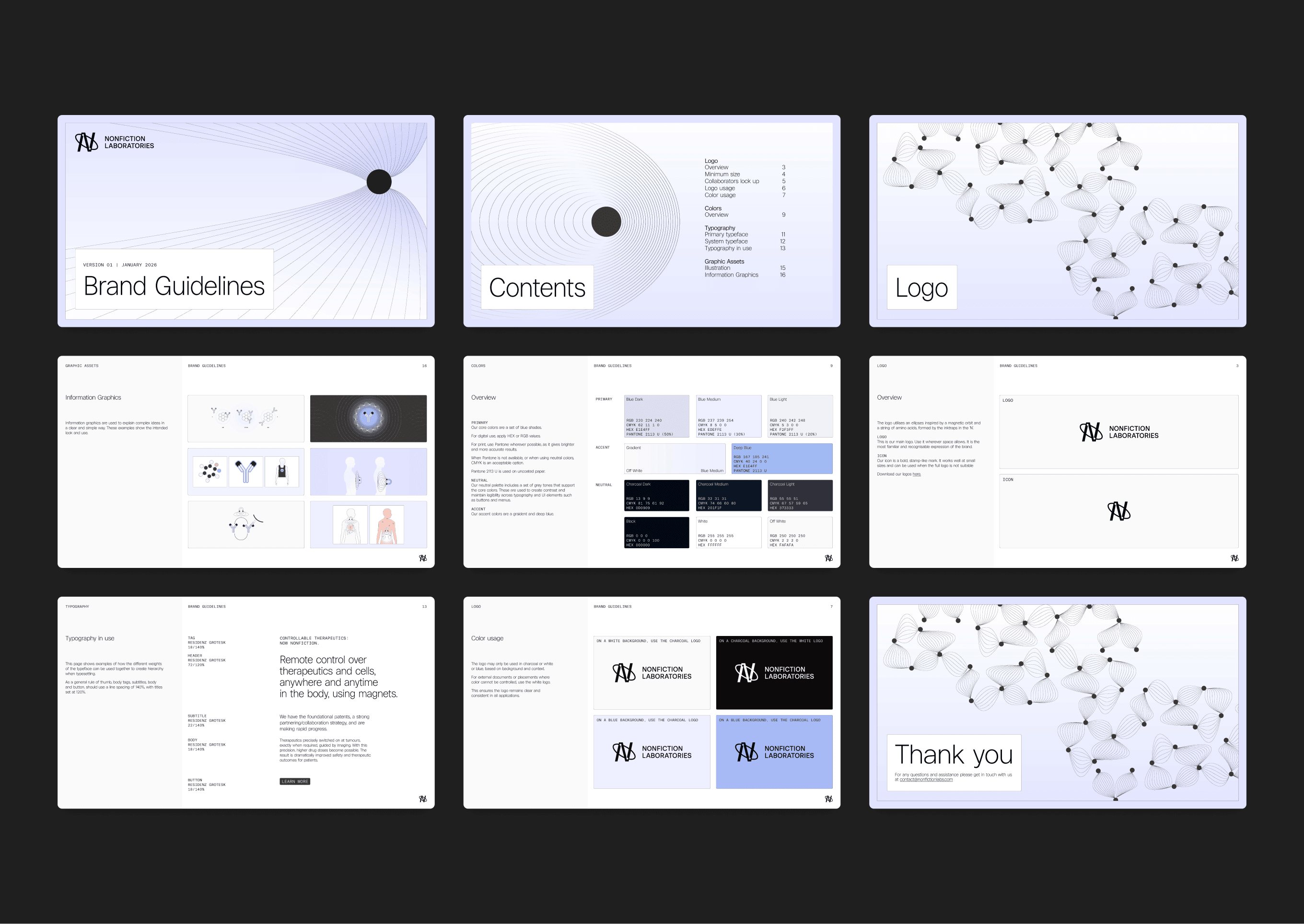
Nonfiction Laboratories
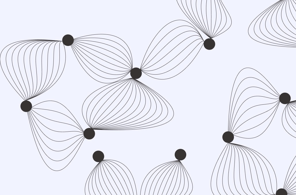
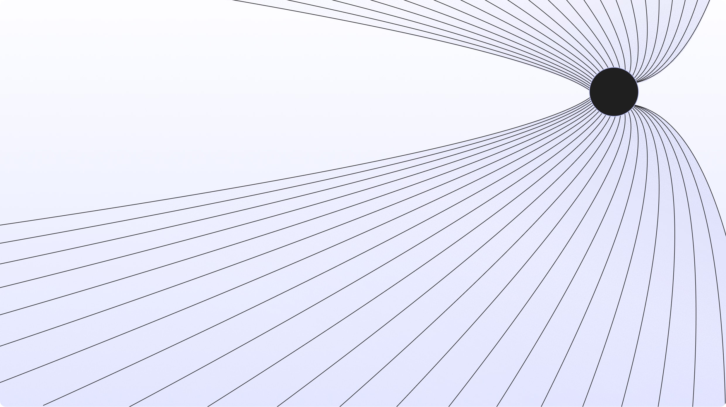
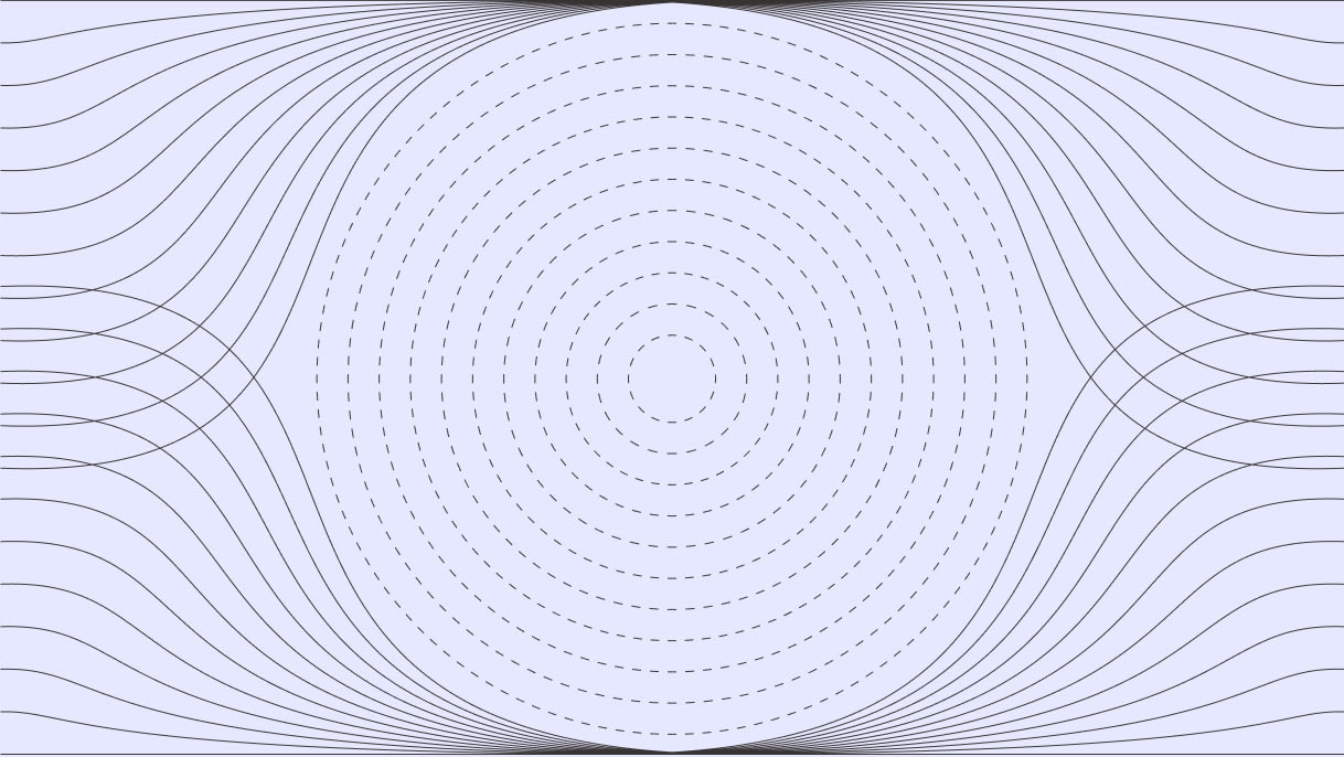
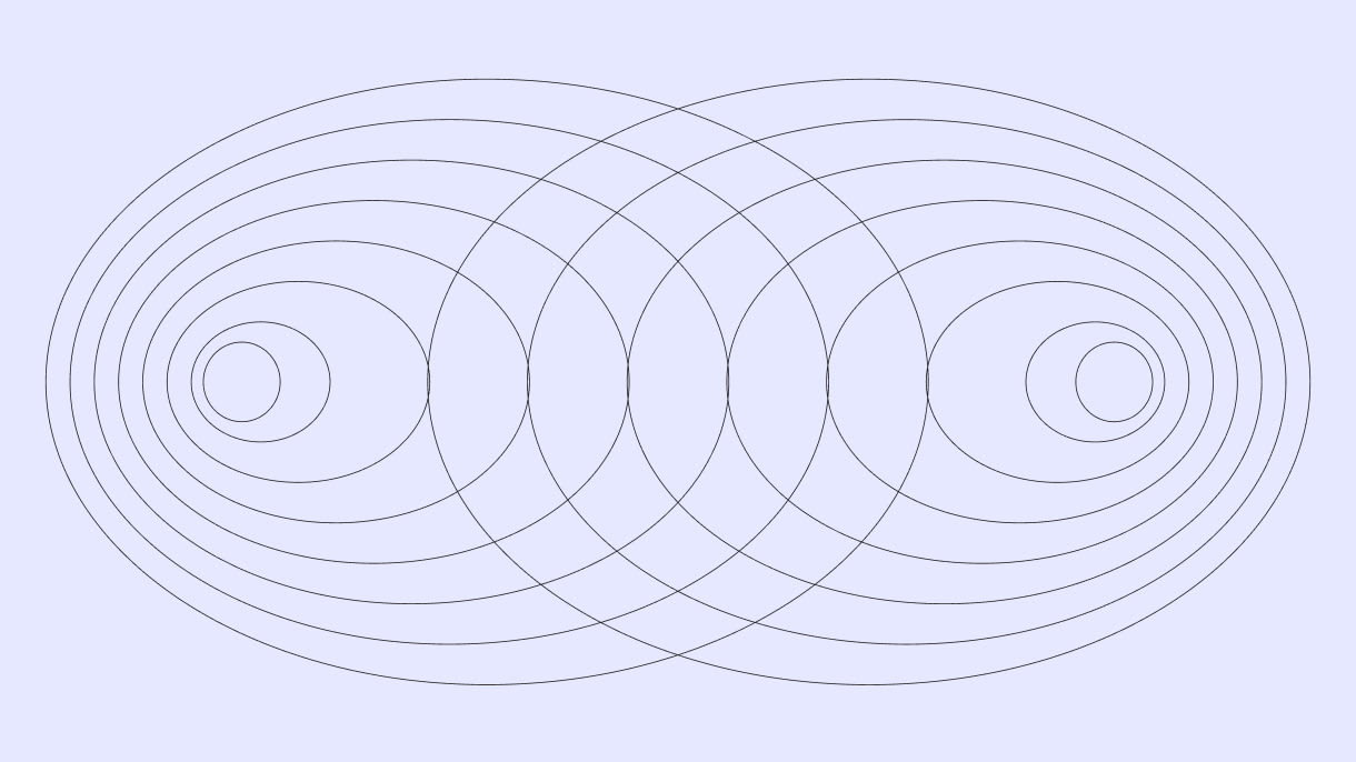
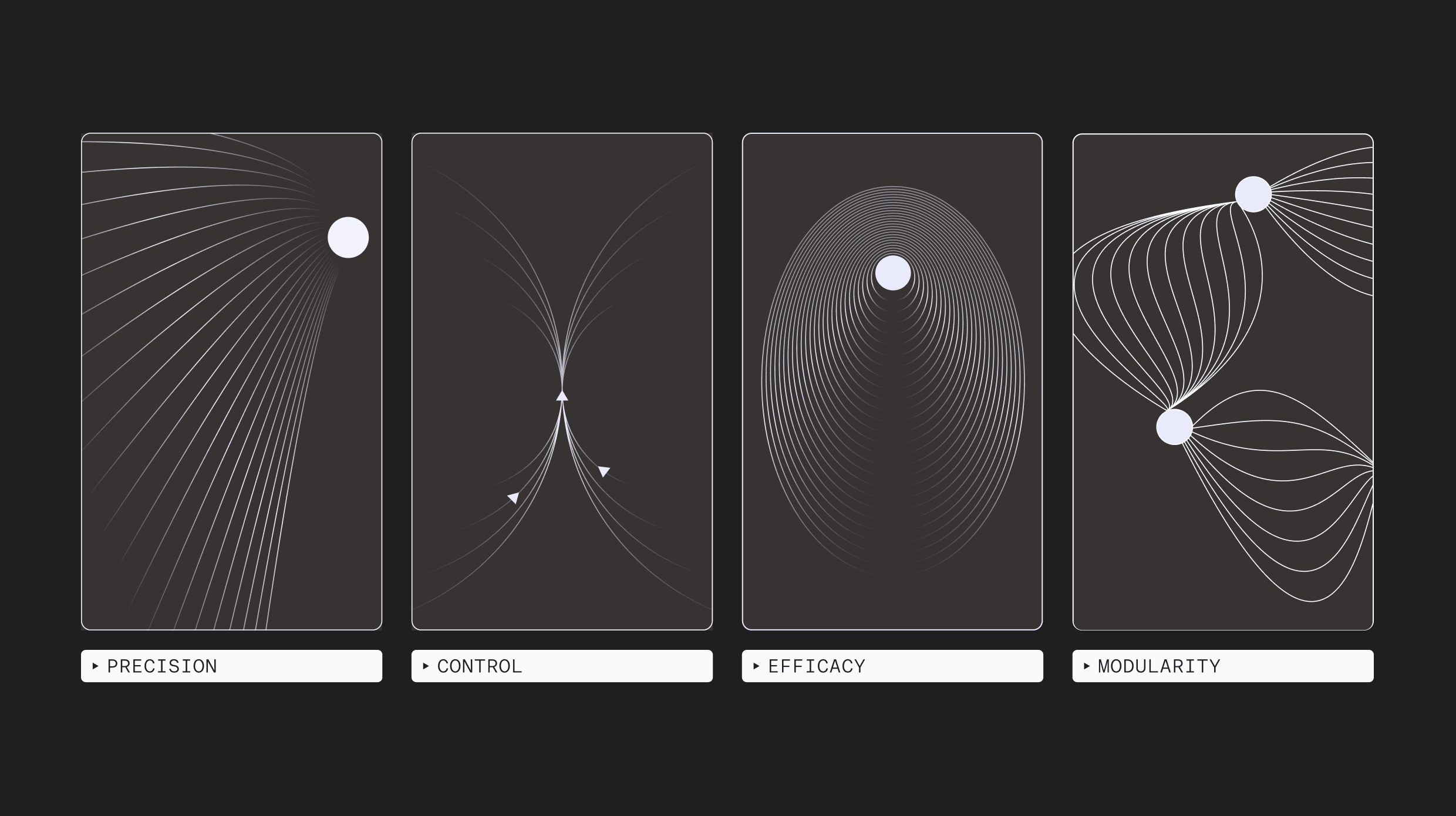
Nonfiction's medicine works because a magnetic field has both direction and inherent intent — it guides a therapeutic to where it's needed and nowhere else — so we made that the underlying concept for their new brand.
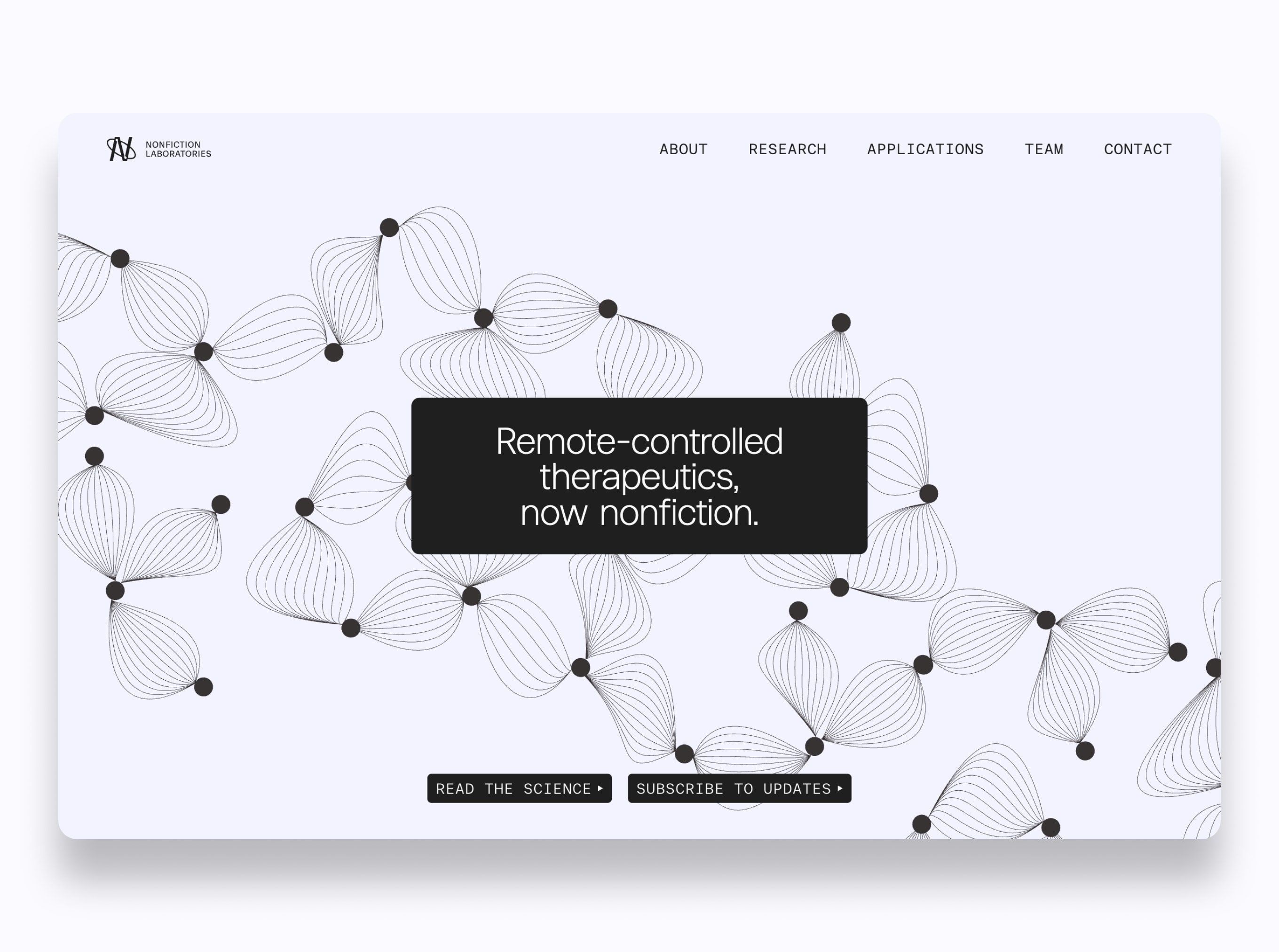
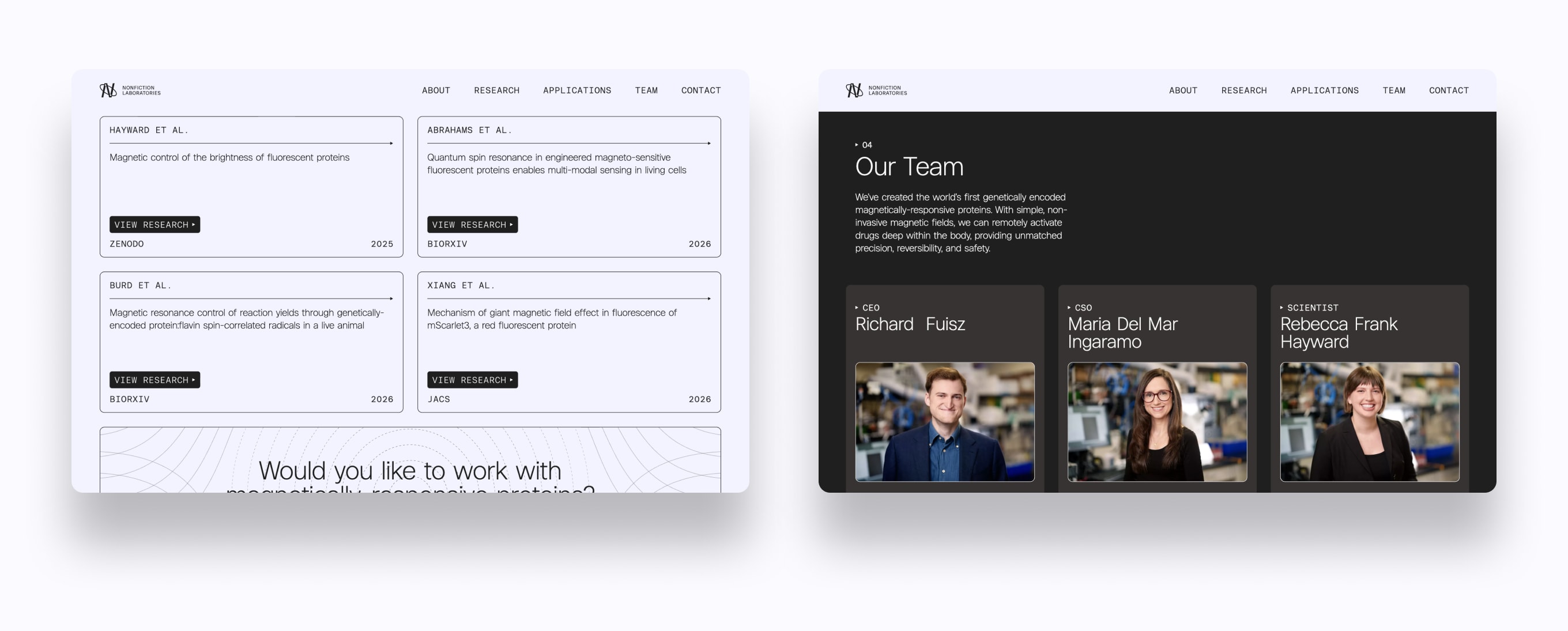
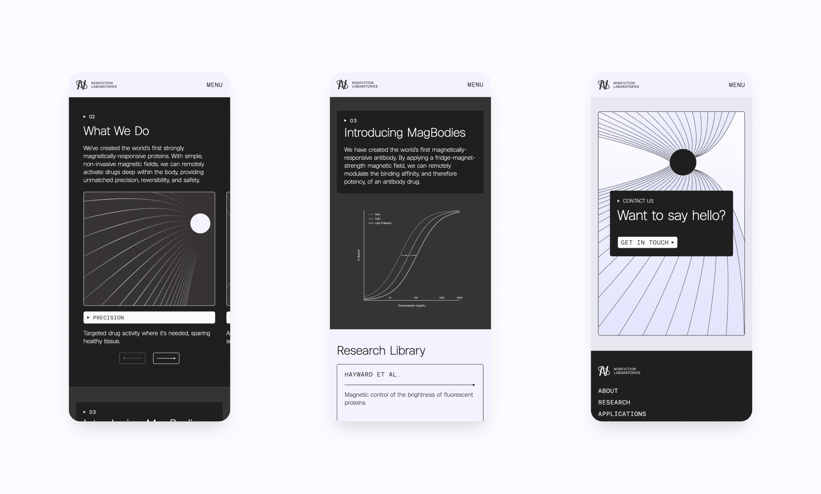
Nonfiction Laboratories is building a new class of medicine: therapeutic proteins you can switch on and off with a magnet. Their identity had good bones, but it didn't yet carry the ambition of what the team is attempting. Our brief was to build upon what existed: sharpening it, broadening the visual system so each element clearly earns its place, and rebuilding the website so the brand reads as rigorous and pioneering; routes investors, scientists, and hires to what they each need; and keeps a note of the unconventional (without tipping into gimmick).
We kept the icon and evolved a deliberate brand system around it. The logo refines the existing symbol, using an ellipse drawn from a magnetic orbit and a string of amino acids formed by the inktraps in the "N" — the science and the mark become the same drawing. From there, a considered palette, a clearer type hierarchy, and related imagery styles all follow the same concept: a field, guiding something precisely. The result is an identity that looks as serious as the data, and as novel as their idea. You can view their new website here.
- Precision
- Clarity
- Rigour
- Nerve

Typography
Imagery
Website
Brand Guidelines