A
A
A
n
n
n
d
d
d
N
N
N
o
o
o
w
w
w

Oxford China Policy Lab

A brand and website for a young Oxford research group working at the fault line of US–China relations and artificial intelligence.

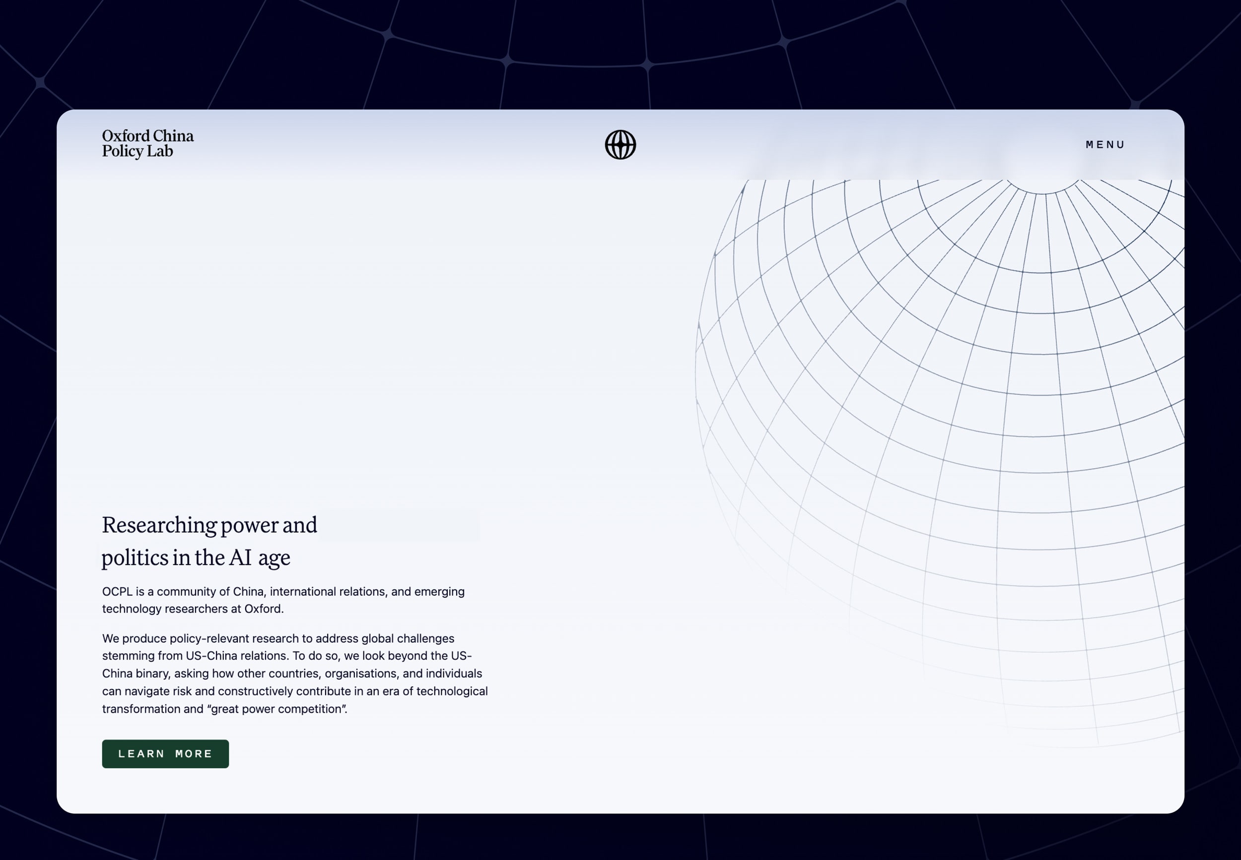
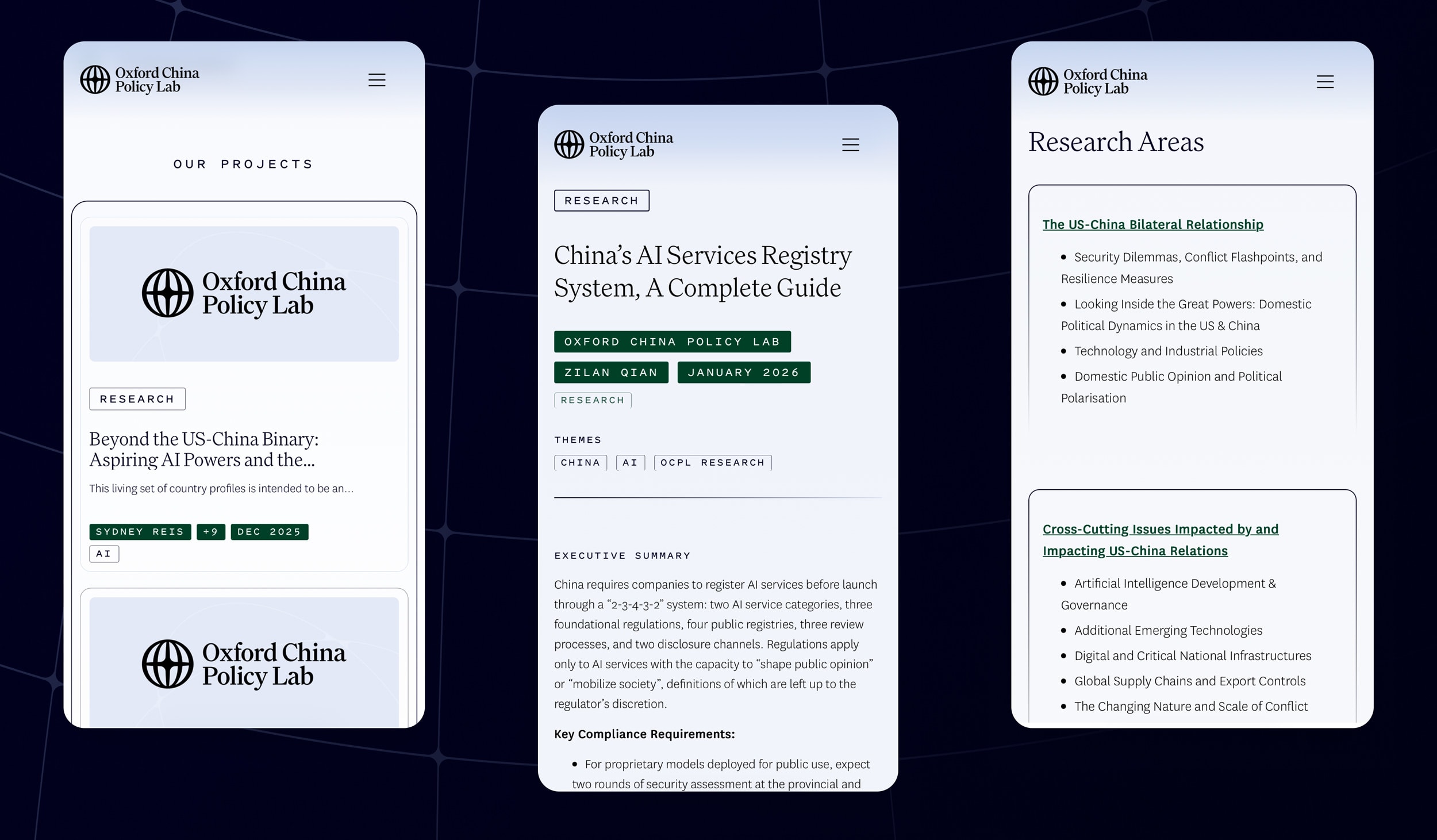
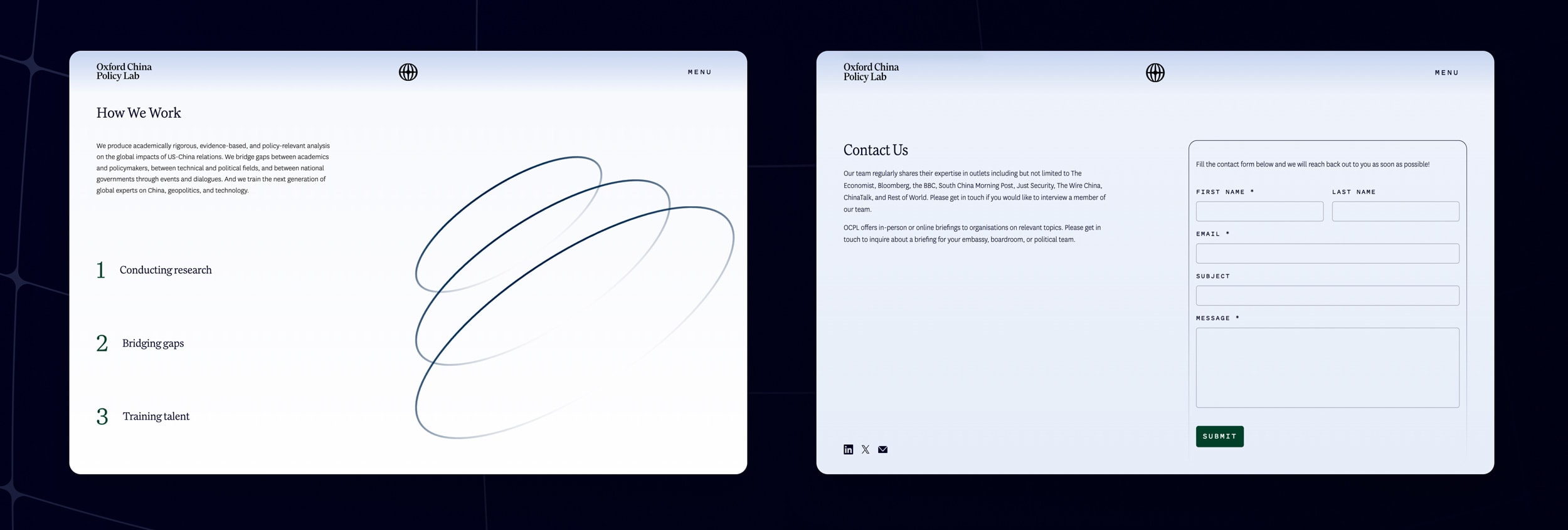
The Oxford China Policy Lab produces research on the risks that emerge where great-power competition meets advanced technology. It also convenes people who rarely share a room, and trains researchers to work across the divides between academia and policy, technical and geopolitical, China and the rest. Its previous identity was serviceable but modest, and said little about the seriousness of the work. We were asked to build something that would last.


The Brief

Give OCPL a durable, professional identity that matches the rigour of its research and the reach of its outlook, and a website built for publishing that work. The identity had to be able to carry two things at once: the authority expected of an Oxford University-based research group, and the energy of a young team working at the frontier of technology and geopolitics.

The Solution

Meridian lines are how we locate ourselves on a globe: a system of reference that works only because everyone agrees to read it the same way. That is close to what OCPL does — the team offers orientation in a field thick with noise — a set of coordinates for readers trying to place fast-moving events. We took the meridian as the organising idea for the identity, not as decoration but as a structure the whole system is built from. The lines form the logo, shape the graphic language and carry through to the website.

LOGO
Core creative concept & Brand Values
Meridian lines — the system we navigate the globe by — became the structure of OCPL’s identity, turning the idea of orientation into a form the whole brand is built from.
  • Clarity
  • Rigour
  • Authority
  • Openness
Colour & Visual Messaging

Typography

Three Klim typefaces, each with its own job — Family, a serif; National, a sans, for the interface and body copy; Pitch Sans, a monospace, for tags and metadata. The monospace carries the technical register the brand requires, which allows us to be more freeform and metaphoric with the brand imagery. The system combines the identity’s two sides — the weight of the research and the technical world it examines.

Meridian Lines

Meridian lines run pole to pole, dividing the globe into a grid we can all navigate by — among the oldest tools we have for placing ourselves in the world. We took them as the starting point for OCPL’s visual language: a set of lines that bends and regroups to form the logo, then extends outward into graphic elements, page structure and the rhythm of the design language.

Website

The website is built to publish research and then get out of the way: clean, content-forward layouts, the navigation kept shallow, no dropdowns between reader and work. It reads as well on a phone as on a desktop, with easy routes to subscribe to the team's substack. The meridian system runs underneath, giving structure to pages that might otherwise sprawl.