A
A
A
n
n
n
d
d
d
N
N
N
o
o
o
w
w
w

ParentData

For parents, people who want to be parents, or anyone who likes to do their research before making a decision.

ParentData began as a Substack newsletter by Economist, Emily Oster, focusing on data, pregnancy, young kids, and topics on the minds of parents. Since its Substack days, ParentData has established a website with (at the time we worked together) a 150,000+ strong user base each month, aiming to give its readers the numbers and decision-making tools required to feel empowered to make their own pregnancy, parenting, and health choices.


The Brief

We were tasked to design a friendly, refreshed website for ParentData. It needed to improve on the UI of the current site, making content simple, accessible and created with tired eyes in mind. The new site needed to enable the platform to grow - both in impact and size - in line with the team’s ambitious future plans to create the most data literate generation of parents.

The Solution

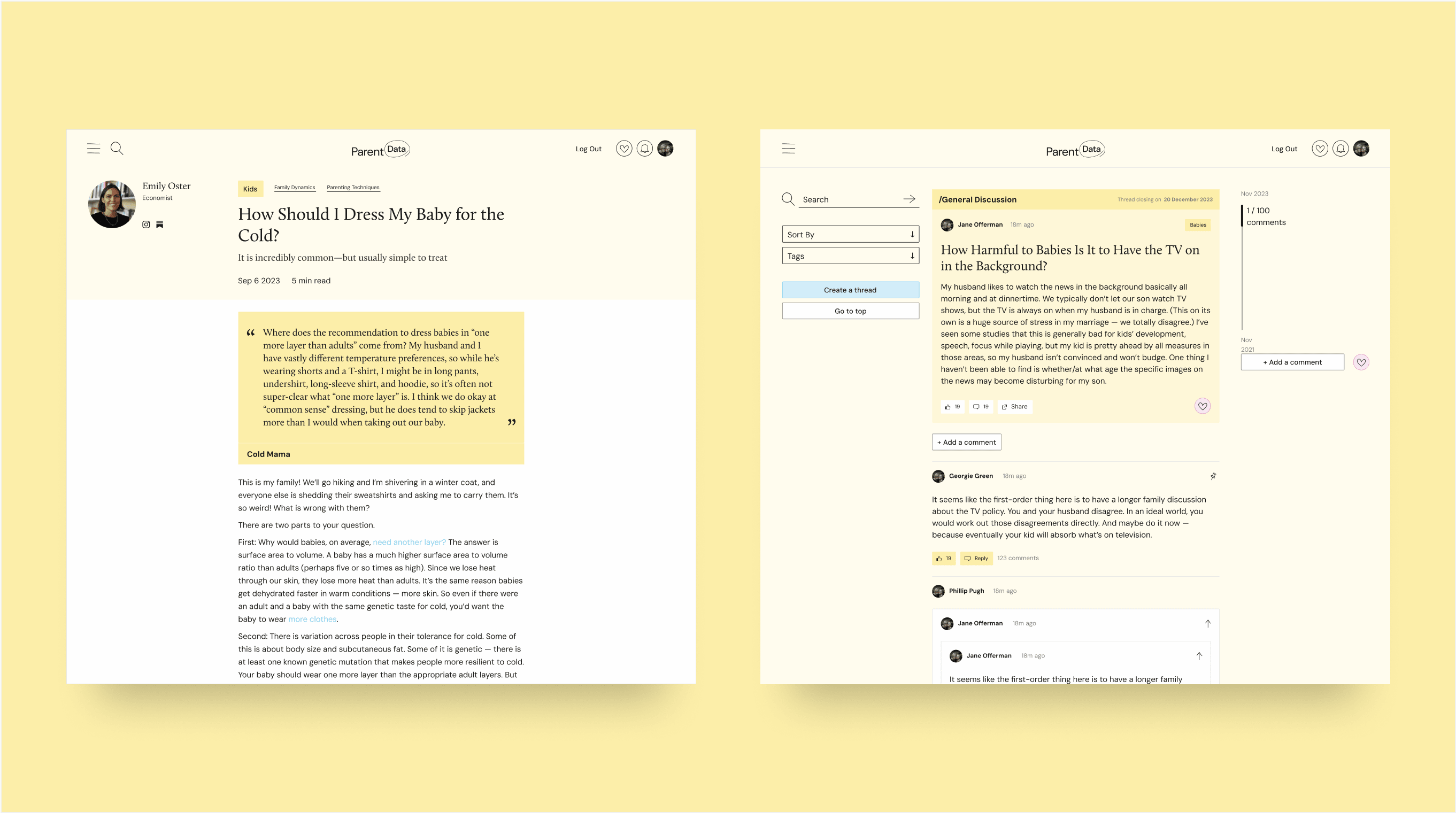
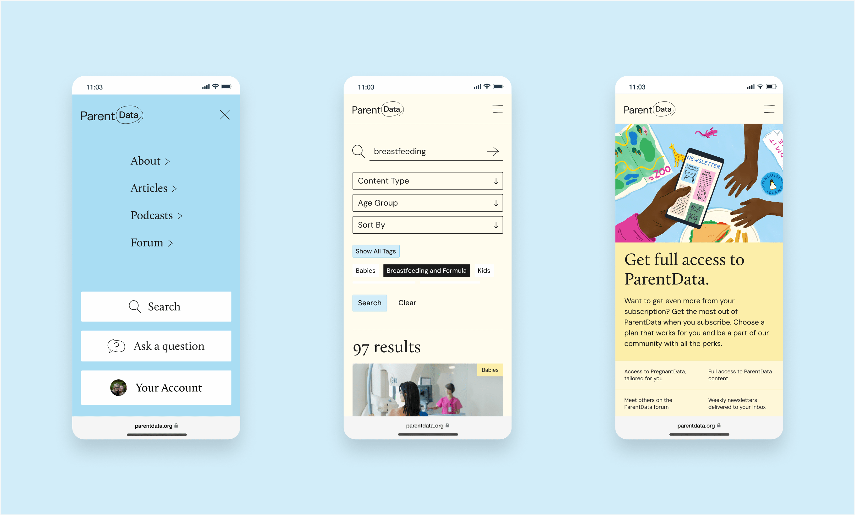
We designed a comprehensive and user-friendly website for ParentData, ensuring all content is easy to access, read, and navigate. The site features a robust search and filtering system, along with a new ParentData forum that enables users to connect with others in the community. We incorporated playful hand-drawn elements into the logo and throughout the site, reflecting the warmth and charm of family life. The colour palette was expanded, with soft pastels and a bright yellow as the primary, uplifting tone.
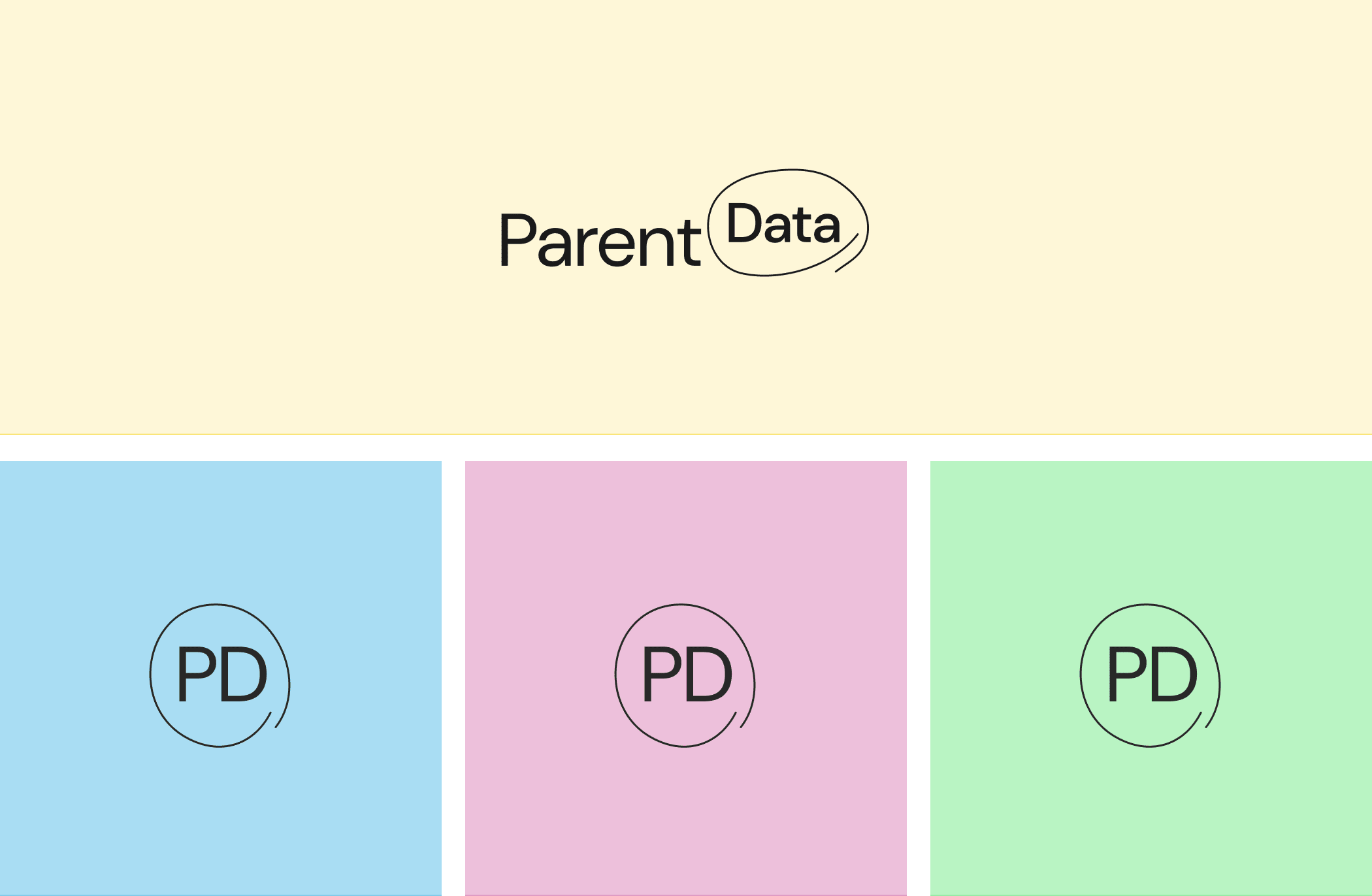
Logo
Meaningful Difference & Brand Values
A supportive, empowering and 
inclusive community for parents— driven by accessible data.
  • Welcoming
  • Empowering
  • Data driven
Colour Palette & Visual Messaging

Typography

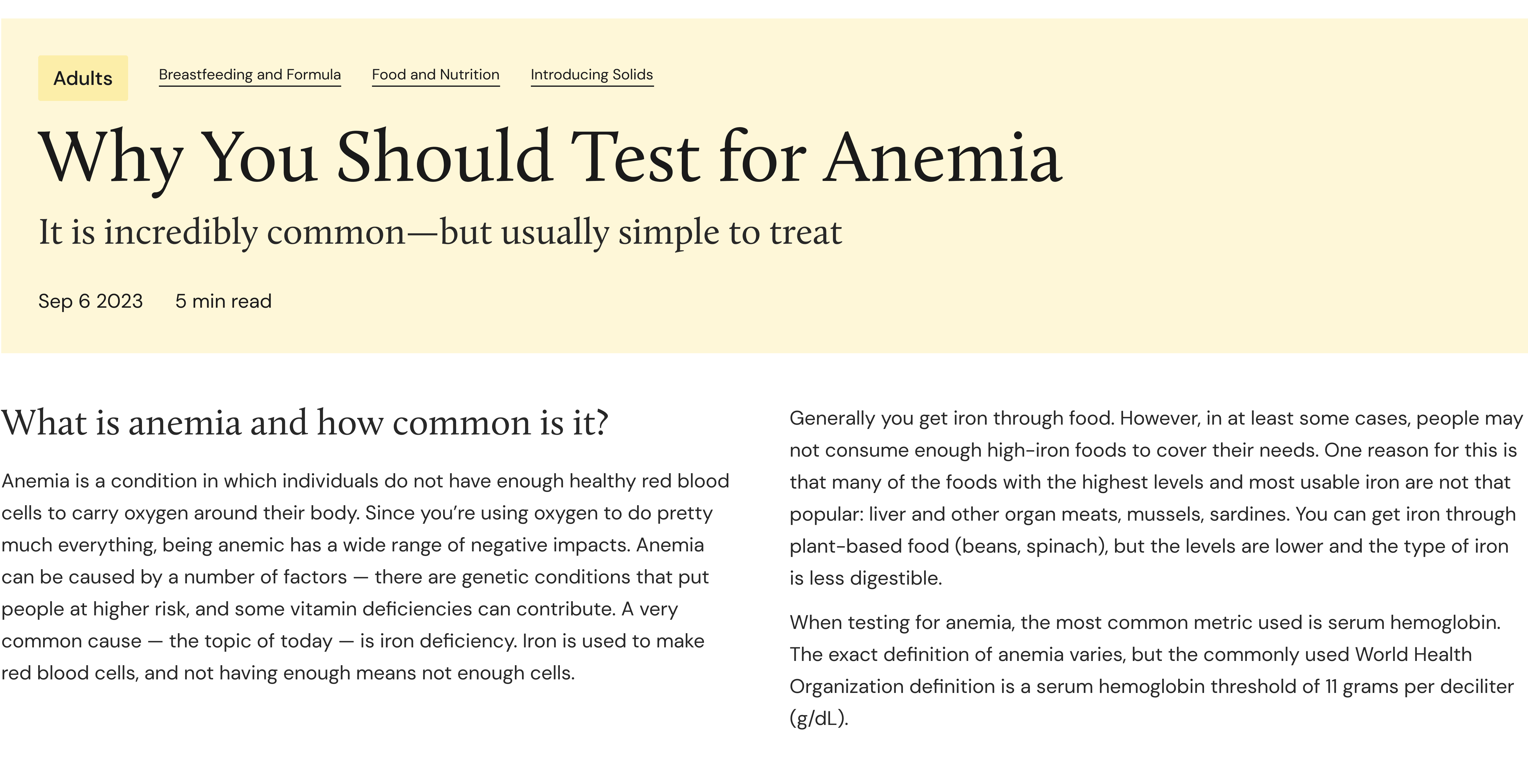
The typography plays a key role, with an overtly editorial feel achieved by pairing a classic serif font for headlines with a clean sans-serif for body text. This combination not only creates a dynamic, modern look but also ensures readability across large blocks of text, making the content accessible and inviting. Together, the typography and overall design choices reinforce ParentData's approachable, professional tone, while enhancing the user experience with a smooth and cohesive visual flow.

Hand drawn elements

Hand-drawn brand elements and text embellishments give ParentData a warm, welcoming aesthetic that feels both personal and approachable. These thoughtful, imperfect touches create an inviting atmosphere that resonates with parents, ensuring they feel supported and understood by an organisation that truly cares about their needs.

Brand illustrations

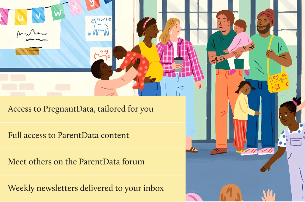
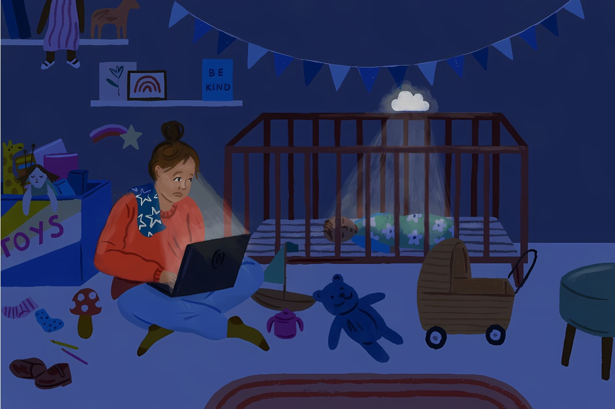
Including playful illustrations of diverse audiences by Amelia Flower brings a vibrant, inclusive energy to ParentData. Her charming, whimsical style captures the beauty of different cultures, backgrounds, and family dynamics, making the brand feel accessible to everyone. These illustrations not only add visual warmth but also send a powerful message of belonging, ensuring that all parents, regardless of their background, feel represented and valued within the ParentData community.

The ParentData Website

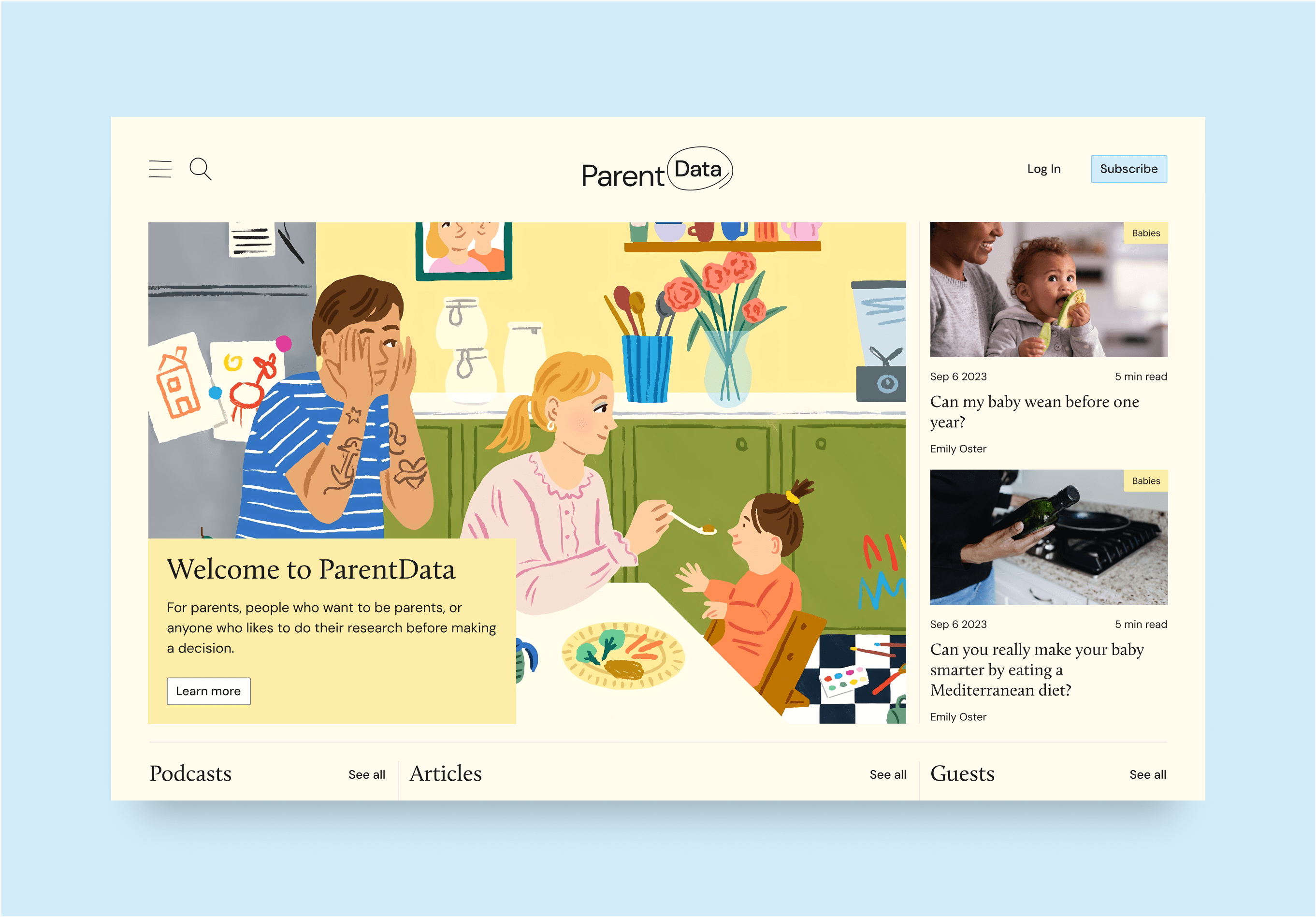
The new ParentData website design focuses on creating a user-friendly, legible experience tailored to the needs of tired parents navigating the site, often during late-night feeds or busy moments. With a clean, simple layout and intuitive navigation, users will find it easy to access the data-driven insights and actionable advice they need without distraction. A focus on mobile-first design ensures fast load times and smooth usability across devices, while the refreshed typography and thoughtful imagery balance approachability with credibility. The streamlined homepage provides clear pathways to relevant content, while easy-to-read articles, clear calls to action, and an accessible subscription funnel ensure a seamless user journey from discovery to ongoing engagement.