Works in Progress Magazine
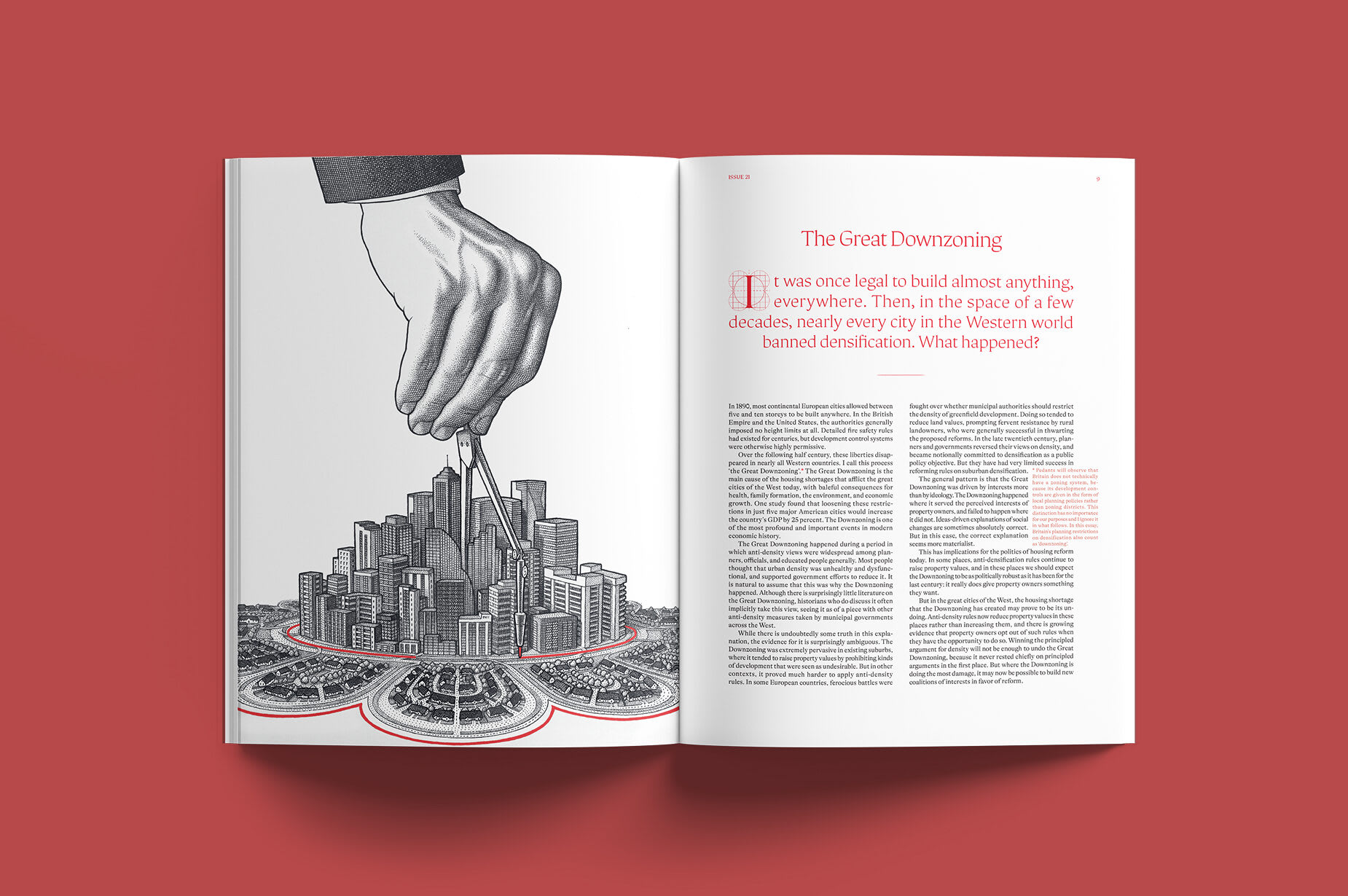
Works in Progress is a magazine of new and underrated ideas for improving the world. We were asked to redesign its print edition, moving it away from the book-like format of earlier issues toward something recognisably a magazine.
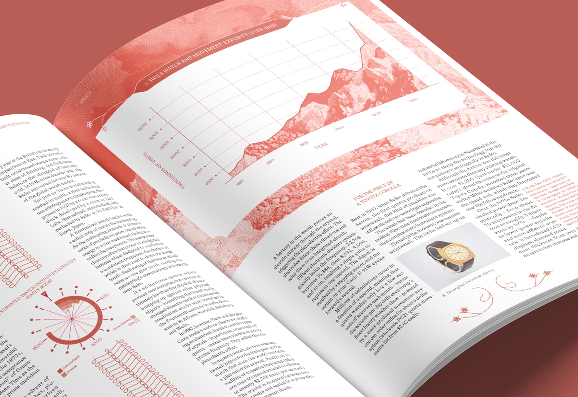
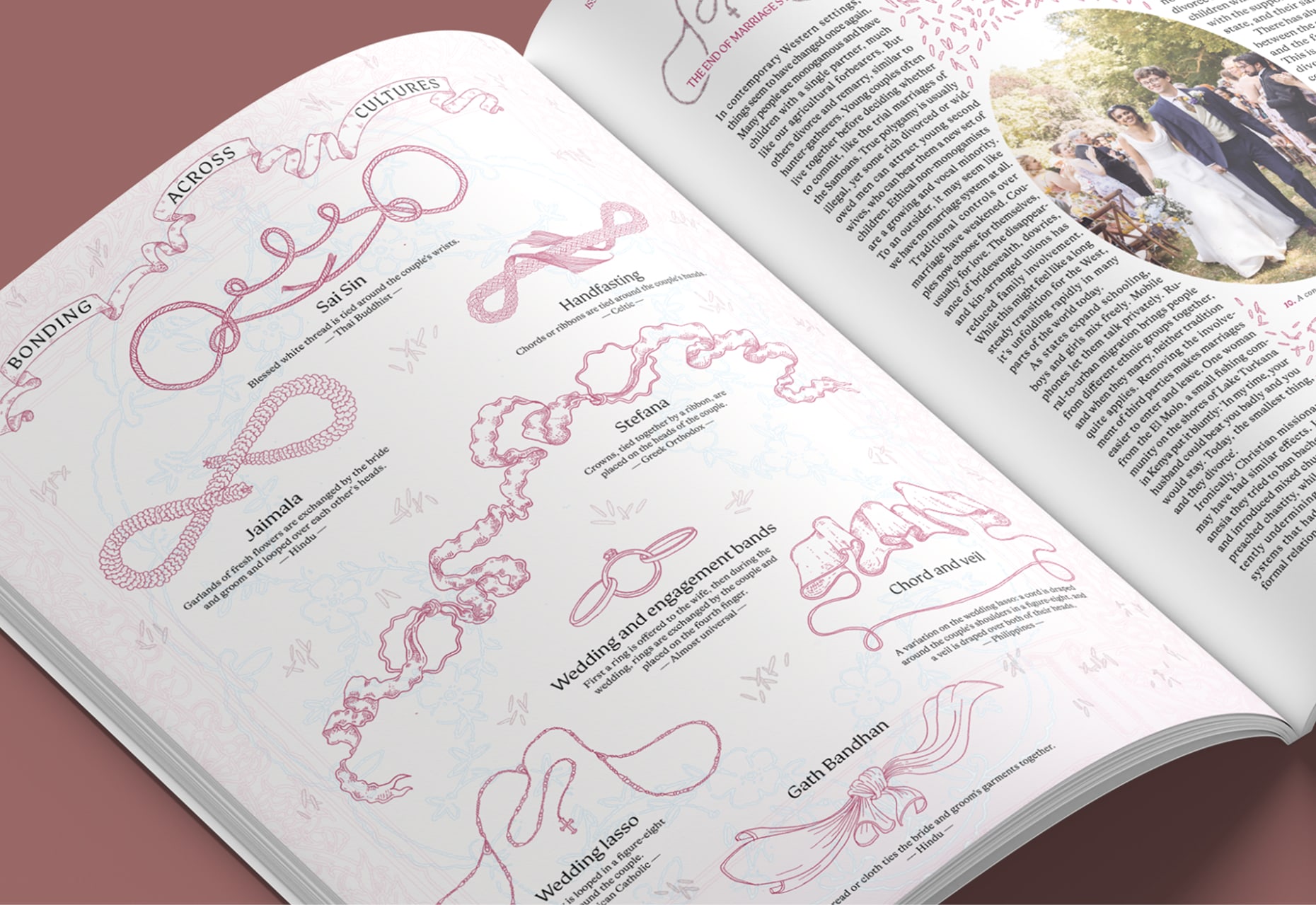
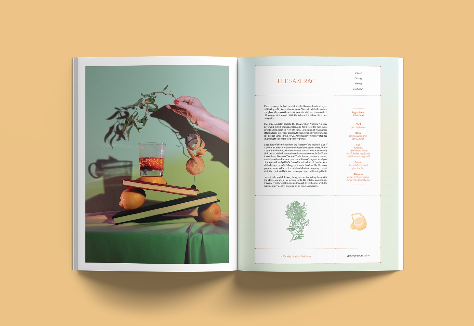
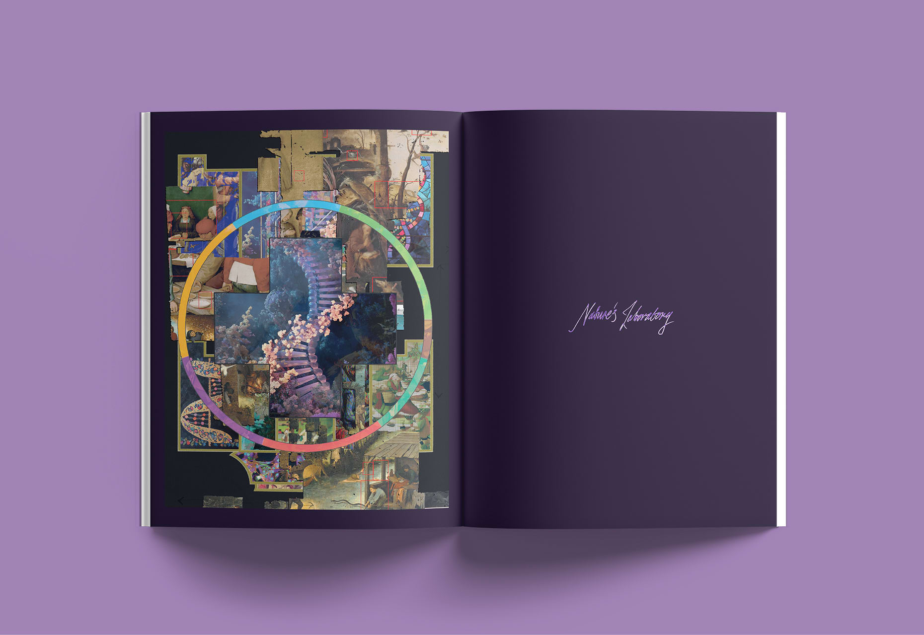
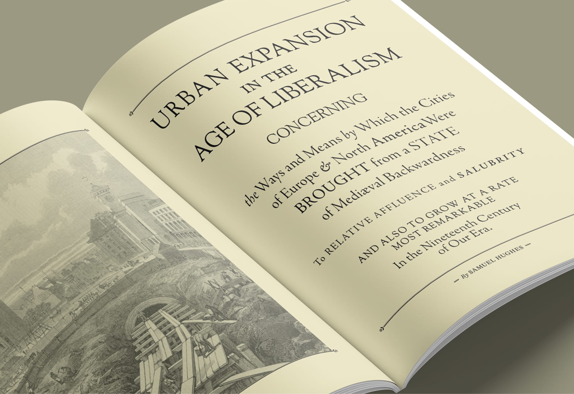
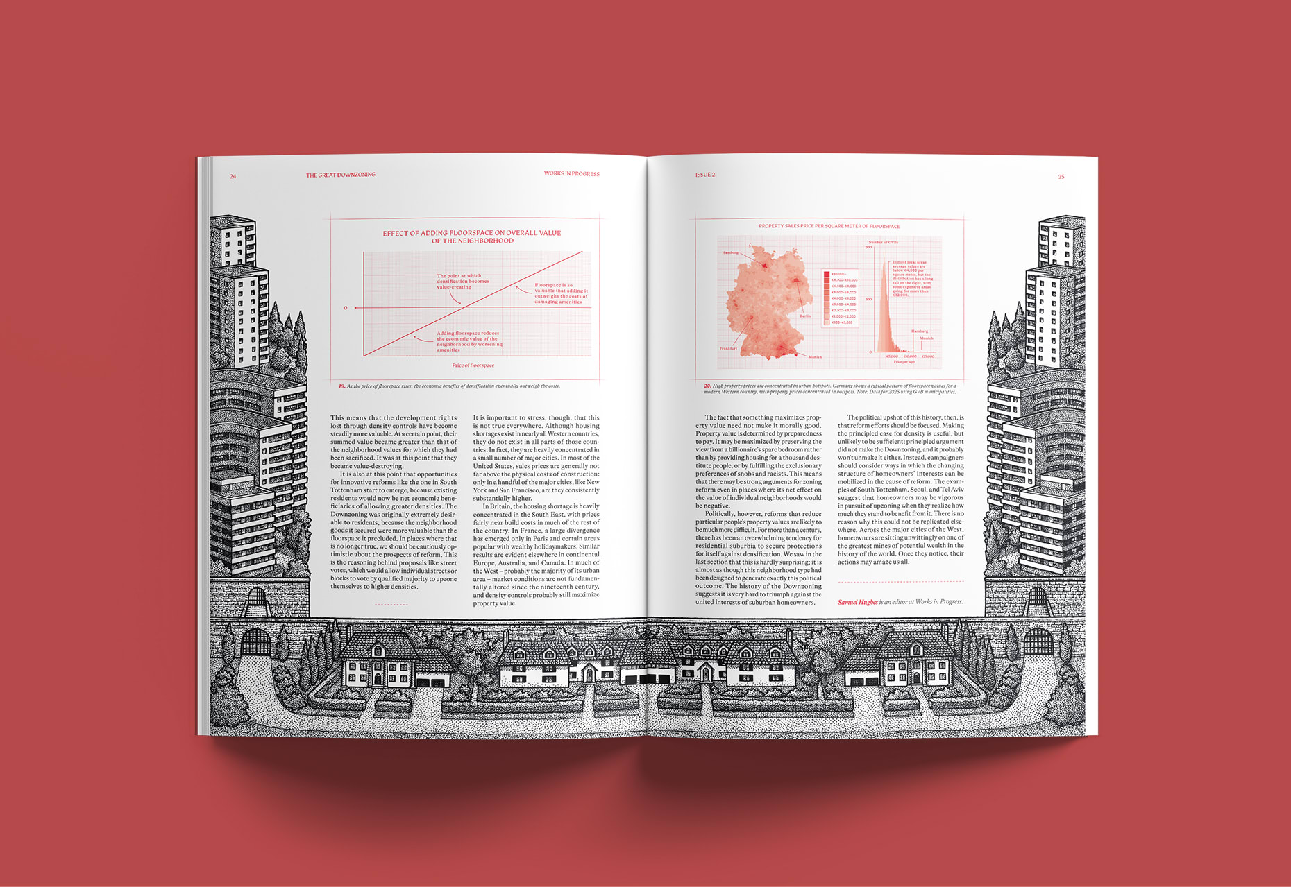
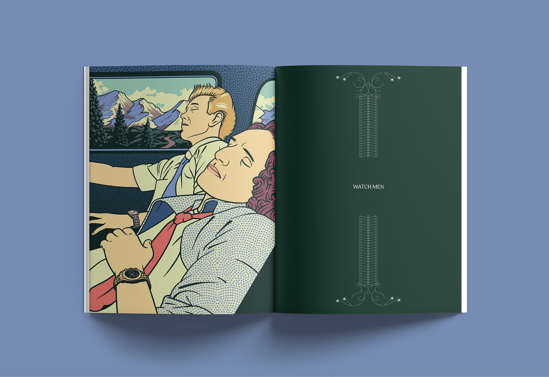
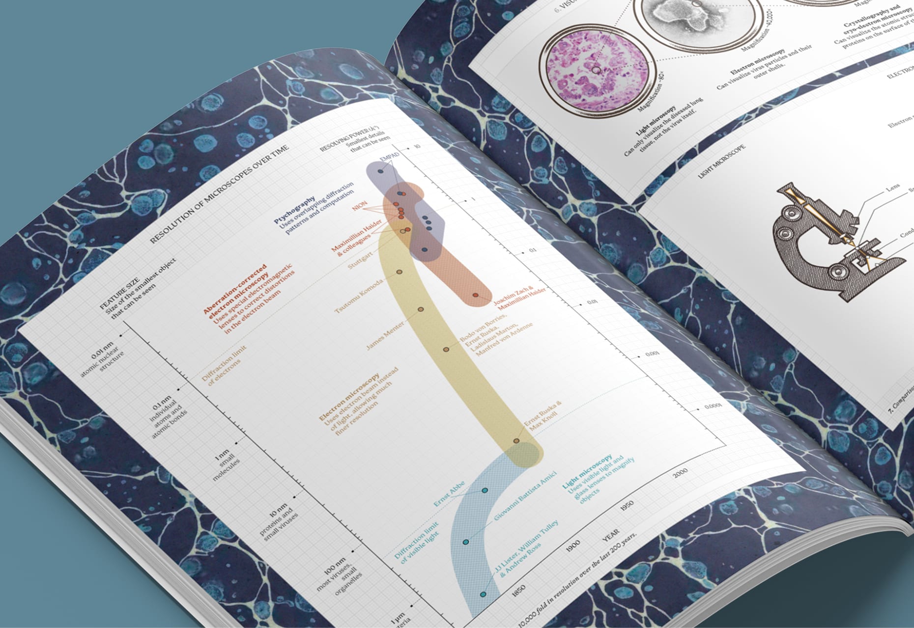
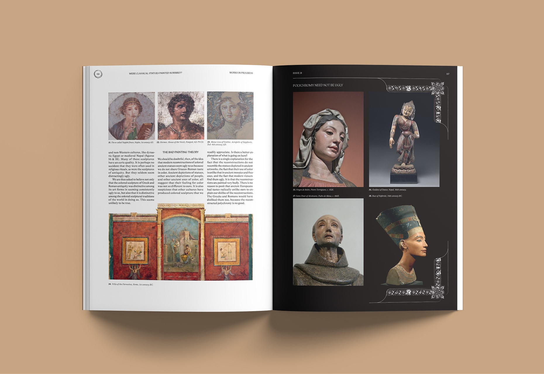
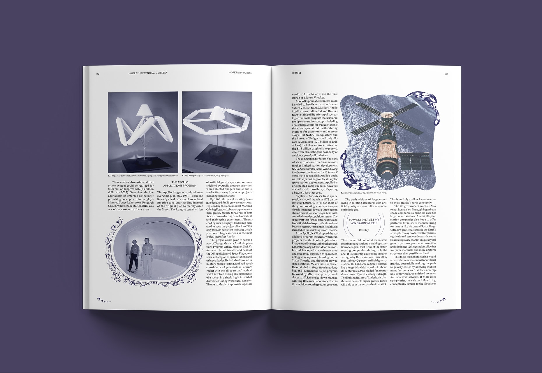
The team wanted a portable, beautiful printed object that reads as a magazine, not a book, and repays a second look. Digital readers know Works in Progress as sleek and minimal; the print edition had to do the opposite — layered and image-led, with something new on each page turn. The harder part: every content type, from a 4,000-word spotlight essay to a one-paragraph mini piece, needed its own design voice while still holding together as one object.
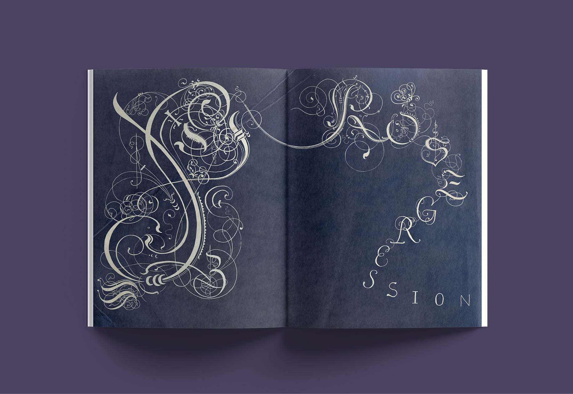
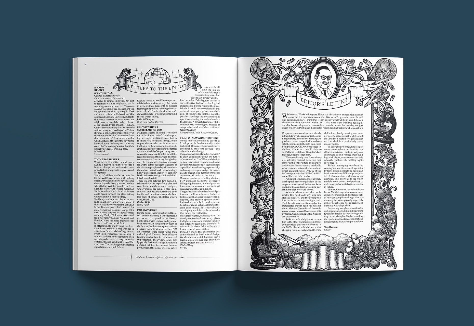
The guiding image is a small medieval town: worth returning to, and quietly rewarding — each visit turns up something missed the first time. The magazine carries a serious intellectual purpose, so we made the design hold some playfulness — the odd detail tucked in the margins, like a gargoyle on a cathedral. The aim is the feeling of multiple ideas clicking into place: each issue a small, self-contained universe within the larger one.
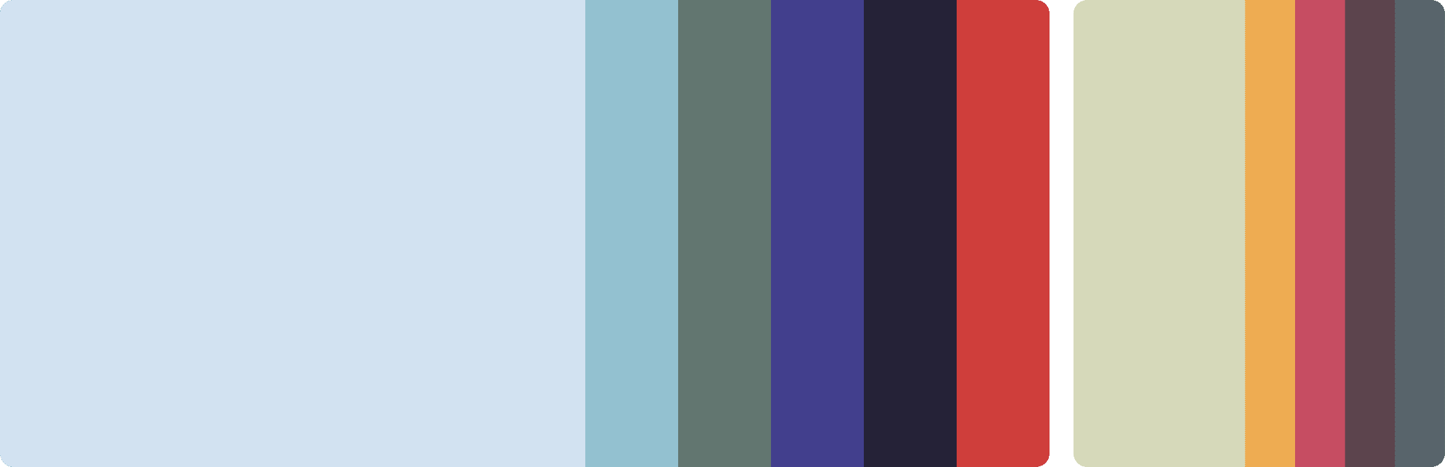
Foundations & Grid System
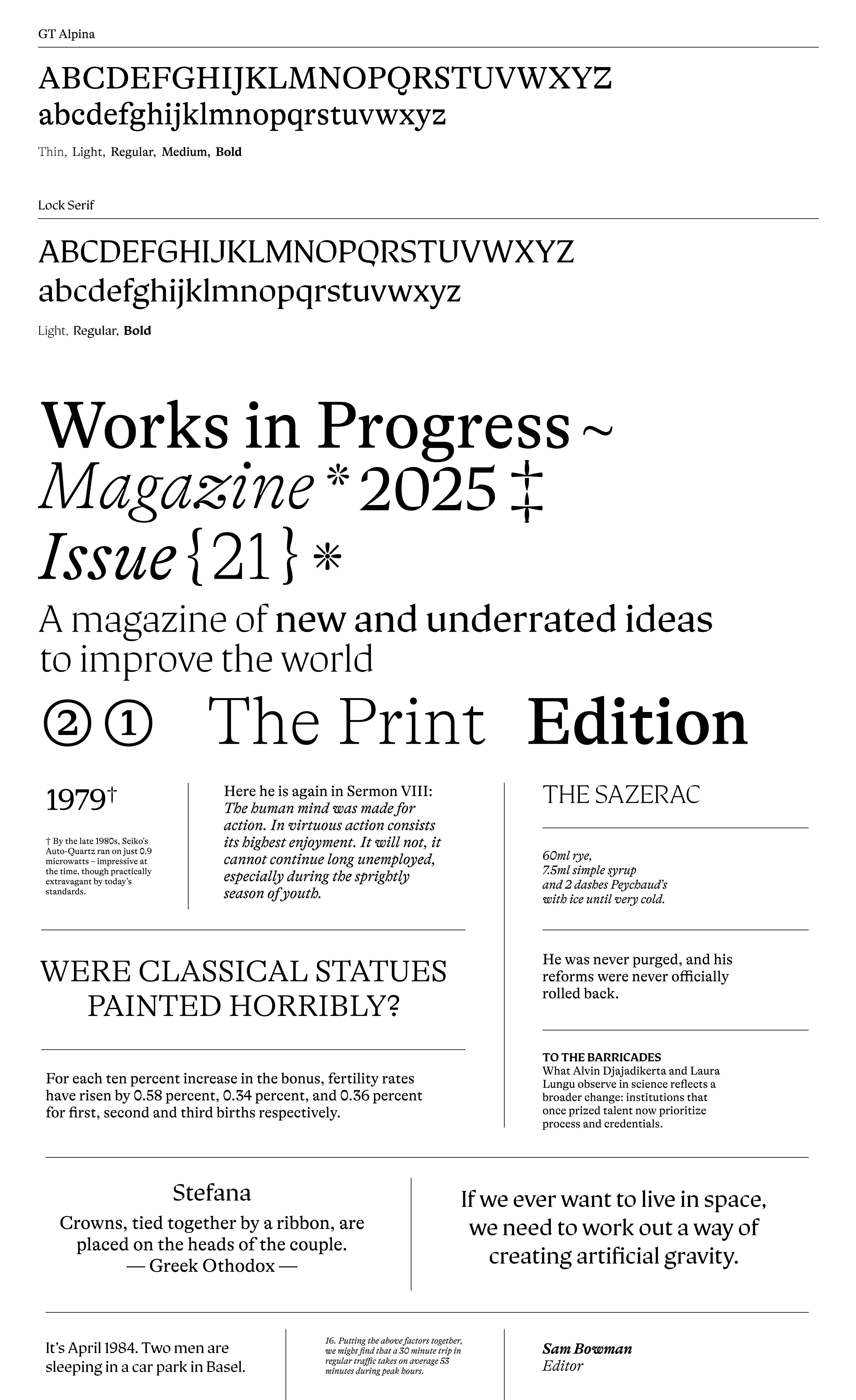
Typography
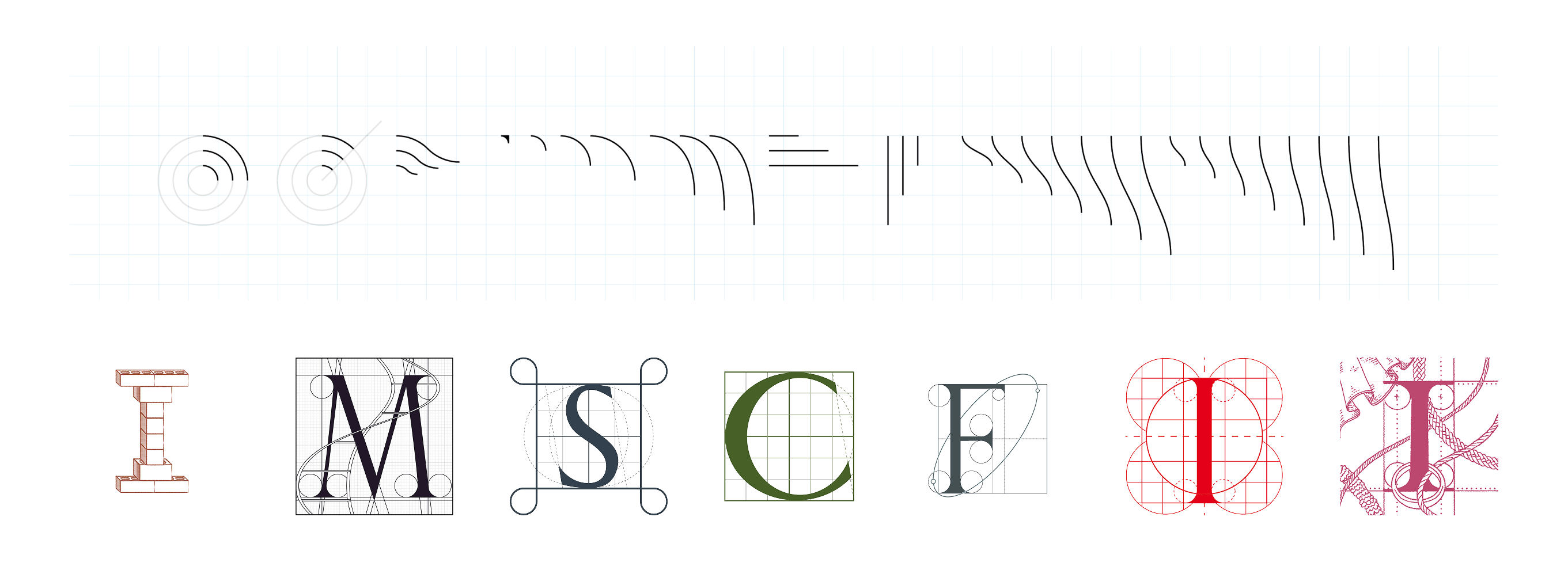
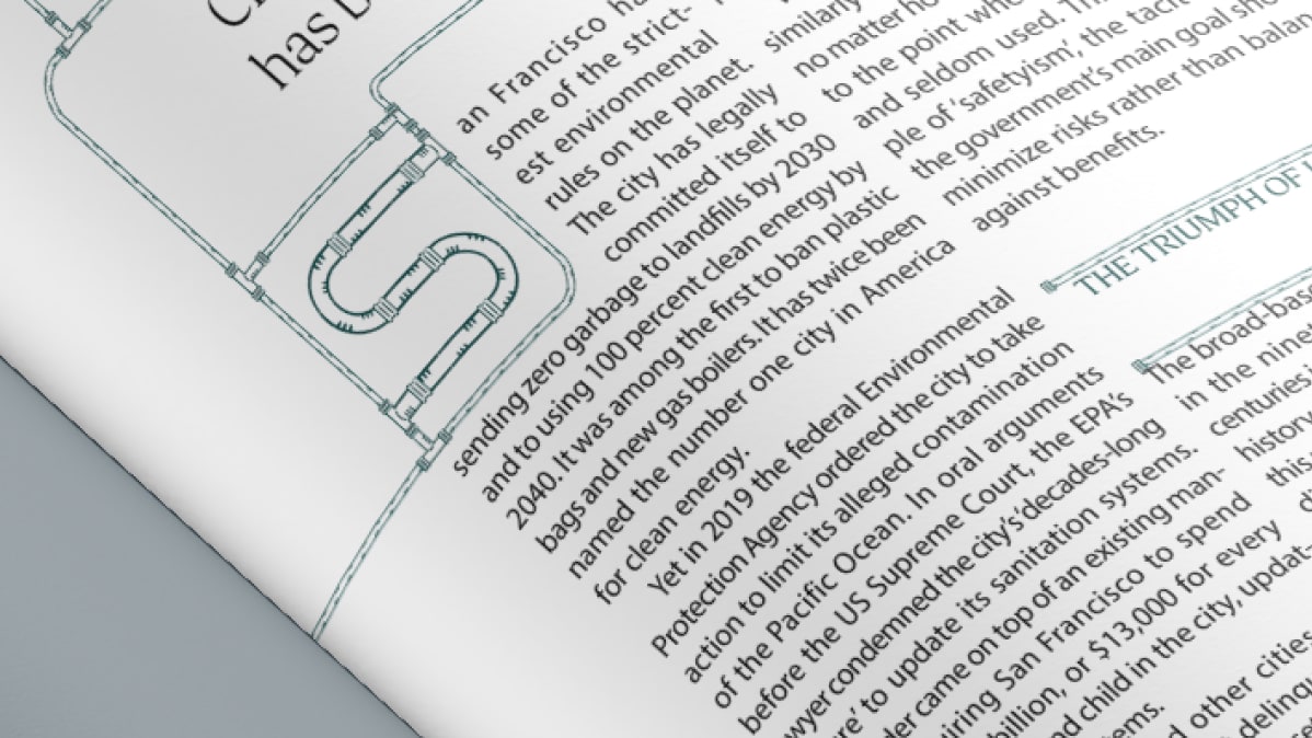
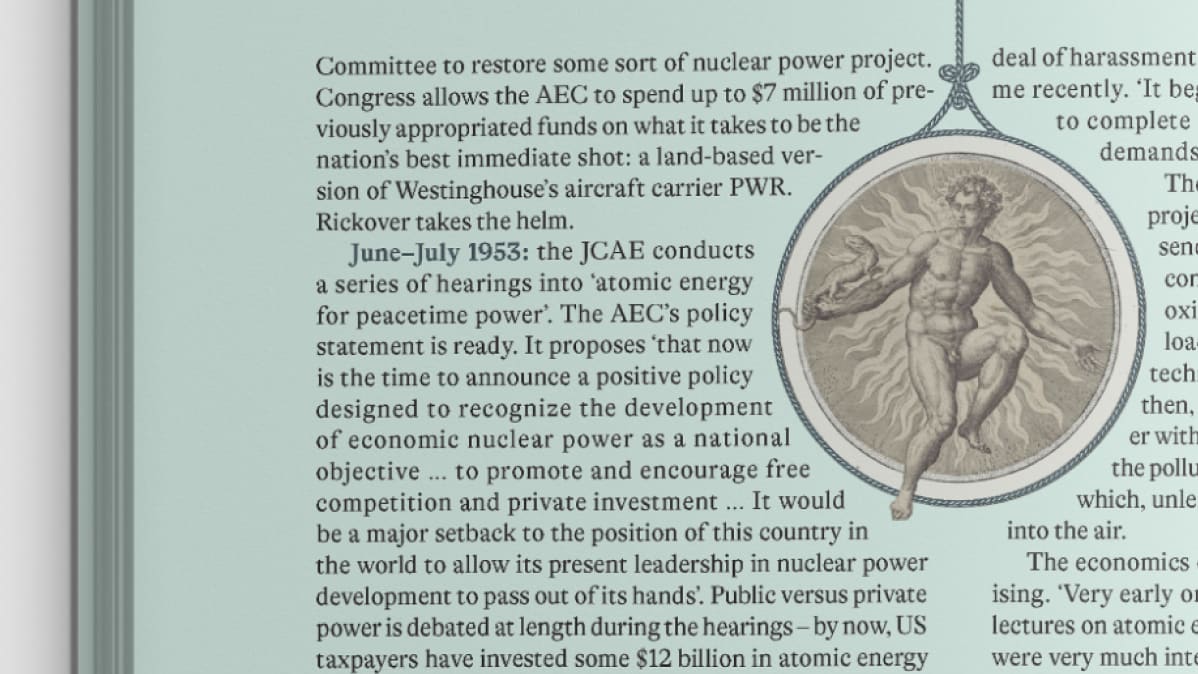
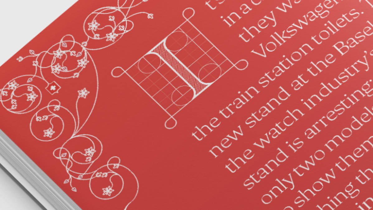
Ornamentation
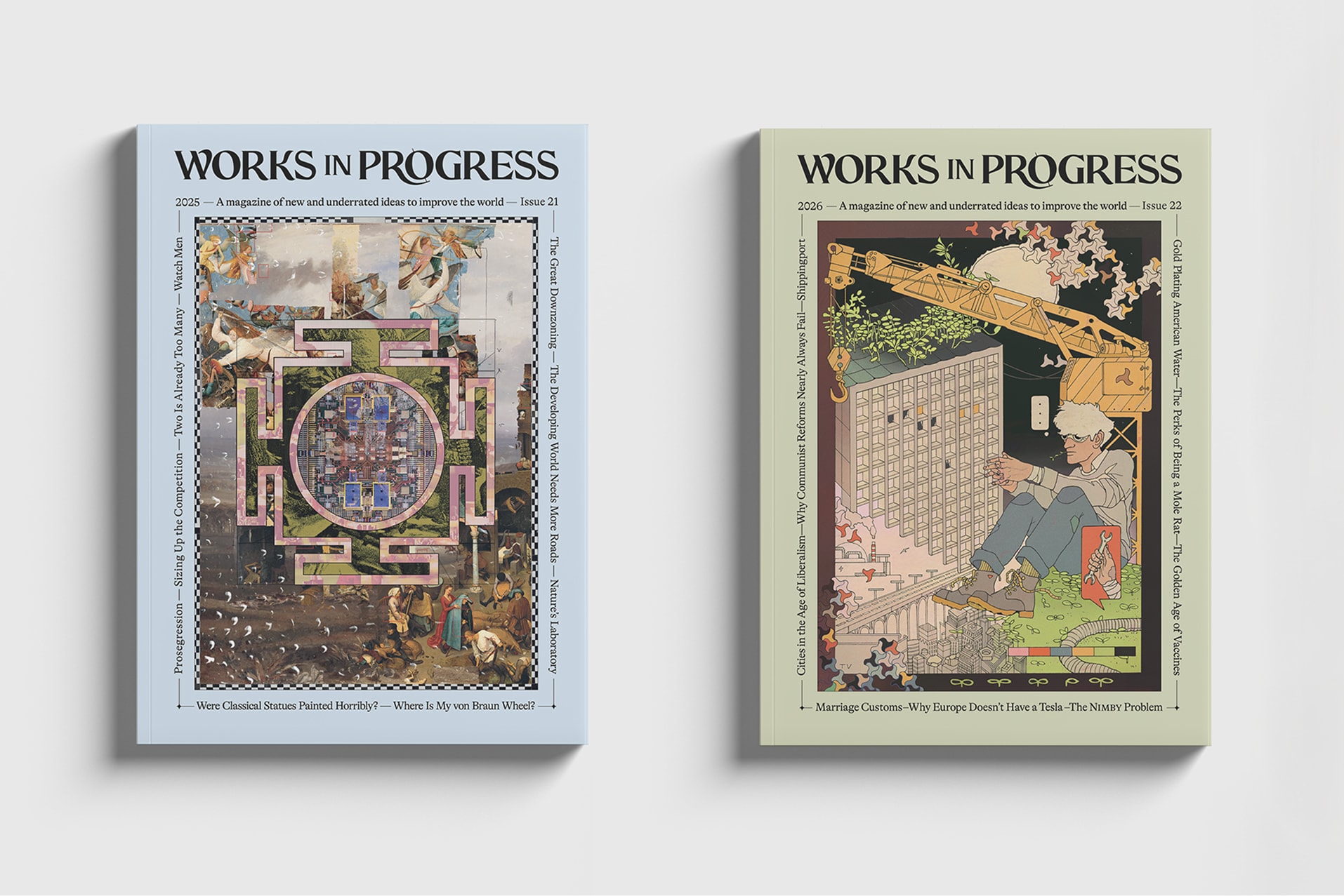
Covers
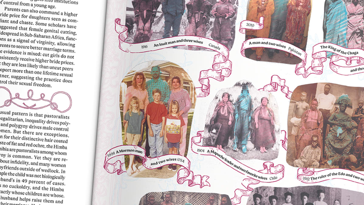
Inside the magazine